.png)


Most Power BI and analytics teams measure how many reports they've built and how quickly they delivered them. Some go a step further and track views. Very few measure what actually happens after delivery.
A report going live is not the finish line. It's the starting line. If nobody uses it (and in the right way) or they glance and leave, it has delivered zero value. The question isn't "did we ship it on time?", it's "did it change a decision?".
The Adoption Scorecard
Over the years, I have used these four dimensions to evaluate every BI product. Not just whether it's being used, but whether it's being used well.
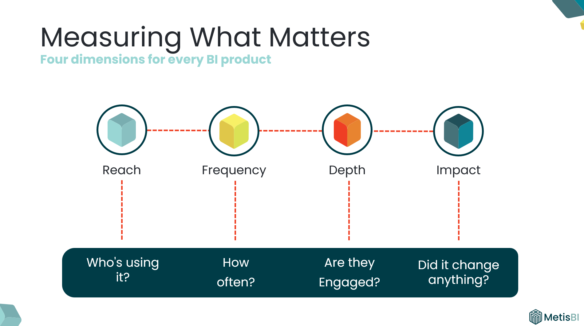
Reach: What percentage of the intended audience is actually using it? A report built for 60 people with 14 opening it has 23% reach.
Frequency: Are they coming back? A report opened 200 times in month one, 100 times in month two and then gradually decreases isn't embedded in anyone's workflow.
Depth: Are they engaging or just glancing, going past first page? A five-page report where most users only ever view page one tells you depth is low.
Impact: Are they taking actions or making decisions or changing direction? For me, this is the most important (and most ignored). But it's the dimension that proves ROI.
Note: If you've worked in marketing, terms like reach and frequency will sound familiar. I've adapted these concepts specifically for evaluating BI products, it’s a framework I have relied on for years and I do not see Power BI teams applying it consistently.
What Each Dimension Looks Like in Practice
Reach: Are the right people even opening it?
- What it measures: Are the intended users of the report accessing or viewing it?
- If low: They don't know it exists, cannot find it or don't have access. Could be a promotion and discoverability problem.
- How to measure: Built-in Usage Metrics report, Power BI Activity Log, Microsoft Purview Audit Logs or Admin Monitoring workspace - compare unique viewers against the intended audience list.
- Signal: This report was built for 60 people. Only 14 unique viewers in the last 30 days.
Frequency: Are they coming back?
- What it measures: Are users coming back or was it opened once and abandoned?
- If low: They've reverted to previous solutions. It's not as relevant for ongoing decisions. Could be a relevance and embedding problem.
- How to measure: Built-in Usage Metrics report, Power BI Activity Log, Microsoft Purview Audit Logs or Admin Monitoring workspace - track return visits per user over time. For windows beyond 30 days, archive the data yourself ideally by pulling the Activity Log daily into your own storage.
- Signal: 200+ on go-live, week two 150 views, week four under 50 views. Gradual decrease week after week.
Depth: Are they engaging or just glancing?
- What it measures: Are users navigating beyond the landing page, viewing multiple pages or opening it and leaving?
- If low: Report is complex, layout doesn't guide to what matters, does not look appealing. Could be a design and usability problem.
- How to measure: This is harder than Reach and Frequency. Start with the built-in Usage Metrics to see which report pages are actually viewed (note on the 30 day limit). It will not tell you which features users used on each page unless you use third-party/custom telemetry. A practical alternative is to book short sessions with users who do navigate across pages (and few who do not), ask them to walk you through how they use the report and what interactions they rely on.
- Signal: Report views are healthy, but page views are almost the same number. Means users open it, look at the first page, leave.
Impact: Did it change a decision?
- What it measures: Are users taking actions that push them closer to achieving an objective or overcoming a challenge? Not “did they open it?” but “did it move the business forward?”
- If low: The report shows pretty visuals/informative content but doesn't assist in decision making or actions. Could be a purpose and ownership problem.
- How to measure: This is the one most teams neglect because it is not sitting neatly in a usage chart. You cannot pull it from an API. You ask. Pick a handful of real users and ask one question: “What did you do differently because of this report?” If you cannot get a clear answer, you do not have impact yet.
- Signal: Concrete change in behaviour example could be “We realised leads were not going to top performers, so we changed the rota and reallocated coverage.”
Note on measurement methods above: For each “How to measure” section above, I have kept it intentionally practical. I am not deep-diving into every possible approach, the fine-print limitations, licensing requirements or how to build a proper adoption model end-to-end. If you want to implement something like this, reach out and I can walk you through the best options for your setup.
What Low Adoption Actually Tells You
Low adoption isn't a failure. It's a signal, we should use it to tell us exactly what's broken/ what is needed.
Low Reach
Meaning: The right people are not opening it.
Response:
- Fix access first (workspace/app audiences, RLS, permissions).
- Increase discoverability (pin it where they work, Teams channels, intranet, app landing page).
- Do a proper go-live, not a “here’s the link” email.
- Use champions to push it into the team’s routine.
Low Frequency
Meaning: They opened it once and did not come back.
Response:
- Tie it to an existing cadence (weekly trading call, monthly performance review, daily huddle).
- Use email subscriptions or alerts with Data Activator, so it lands when decisions are made.
- Check refresh cadence matches decision cadence (no point refreshing weekly for a daily decision).
- Reduce friction (one link, one place, clear “what is this for?”).
Low Depth
Meaning: They open it but do not go beyond page one.
Response:
- Simplify page one and make the next step obvious (navigation, clear prompts, less clutter).
- Add guided pathways (buttons, bookmarks, clear “if you need X go here”).
- Run a short walkthrough and watch where users get stuck.
- Remove pages that do not earn attention (and stop pretending they add value).
Low Impact
Meaning: No actions are being taken, no movement to purpose (achieving objective/overcoming challenge).
Response:
- Revisit the purpose and storyboard (what decision is this meant to support?).
- Validate KPIs, targets, and context so users know what “good vs bad” looks like.
- Make actions explicit (what should someone do when they see this?).
- Sit with the audience and ask: “What did you do differently because of this report?” If they cannot answer, it needs rework.
Note on responses above: The responses are the most common fixes I have seen work over the years. They are not a one-size-fits-all playbook. What you do in practice will always depend on your organisation, your culture, and the people using the reports.
Why Impact Matters Most (But Can't Exist Alone)
I always push for impact measurement because it's how you move from "we delivered 15 reports" or "we have people viewing the report" to "our BI function contributed to these business outcomes."
But impact doesn't exist in isolation. If reach is low, nobody sees the insight. If frequency is low, they see it too late. If depth is low, they never get to the detail that drives the decision.
All four dimensions work together. Impact is where the value lives, but the other three are what make it possible.
Make It Practical
Pick your top 10 reports. Score each one across these four dimensions. Within a few weeks you'll know which reports are genuinely driving value and which ones are sitting there consuming your team's capacity for no return.
That’s the difference between pumping out reports and building BI that actually gets used.


.avif)
%20(8).png)