.png)


You enter your Power BI report, viewing your data, admiring your KPIs being in the green, seeing your sales breakdown by region, then all of a sudden your not on the default view.
- Why has that number changed?
- Why does this chart look different?
- Was the bar chart always like that, why are some elements greyed out?
Power BI IS BROKEN!!!
Hold on, before you jump on your Power BI Developer, lets take a moment to learn how visuals interact with each other.
What are Edit Interactions or Visual Interactions?
We should first understand, when we build a Power BI solution, think of all the visuals and the data behind the visuals (depending on your data model), to be somewhat interconnected. Each visualisation, can act as a way to filter another visual. This is the default behaviour of Power BI and its a good thing!
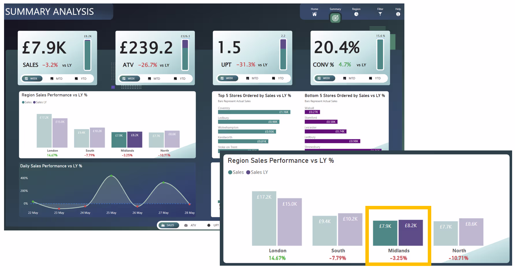
So, lets have a look at the below example. If you click the columns for "Midlands" from the column chart, the line chart below it will display only the data points relevant to the selection. If you wanted to analyse performance of that single region (Midlands), this helps you focus in, so you can spot patterns or issues instantly.

Don't believe me, lets see another example for the below. If this time you click the columns for "London", notice the line chart now displays differently, as its the data points relevant to the "London" selection. Again, imagine you was the regional manager of London and you wanted to see the daily performance of your region only. Well, no need to look for filters or slicers, just select the columns for London, and everything will filter to that selection.

Great - Visuals Interact with Each Other, Lets Turn It Off!
Now hold on... I get this all the time! Whilst I understand the thinking behind it, as the interactions between the visuals might cause some confusion, this is not the answer. The visual interactions in Power BI can be a very helpful feature when developers know how to configure it correctly and when end-users have been given some level of support to understand how it works.
There is a way, to turn it off and sometimes it makes sense to do so. However, that shouldn't be a standard development practice when working with visuals in Power BI. Use them in the right way.
How to Configure the Edit Interactions Between Visuals?
Microsoft had this feature in Power BI super early, so I am still surprised I find many questions around this feature. To access the feature of Edit Interactions, also known as Visual Interactions, we simply follow the below steps whilst in Power BI Desktop:
- Select the source visual - this is the visual you want to control how it affects others.
- Go to the Format ribbon in Power BI Desktop.
- Click "Edit Interactions" - after clicking, icons will appear on the other visuals.
- Choose the interaction icon (filter, highlight or none) for each target visual using the icons shown.
The below image shows steps 1, 2 and 3 from above. Also, check out the tooltip Microsoft provides, as I think its a good explanation.
Note: This can also be done in the Power BI Service, but we are focusing on Power BI Desktop.

Once you select the "Edit interactions" button the visuals on the canvas may start to look "messy". Have a look below. Have you seen all the interactive icons that now appear on top of the other visuals? Don't worry, we will go ahead and explore the three possible icons that appear.

Interaction Icons: Cross-Highlight, Cross-Filter, None
In the image below, you can see the three interaction icons. These icons appear on top of the visuals that act as the "target" visuals - the ones being affected. Just to clarify, the "source" visual is the one you're selecting to control how it influences the other visuals, which are referred to as the "target" visuals.
- Cross-Filter: Restricts the data in the target visual to only the selected values from the source visual. It almost acts like a slicer and is ideal when you want the target visual to focus only on the filtered segment.
- Cross-Highlight: Highlights the selected data in the target visual while still showing the unselected data but greyed out. Great for showing how a selected segment contributes to the whole.
- None: Removes any interaction between the source and target visuals. Selecting data in the source visual won’t affect the target at all. It's useful when you want visuals to remain static regardless of user selections.

Hopefully you are now getting more comfortable with the way visuals interact in a report. Just remember, select the visual (source), you will then see the above interactions icons appear on all other visuals (target) and you will have the options to apply none, filter and highlight.
One last note on this, not all visuals support all three interaction icons. Some visuals will show Filter, Highlight and None, while others may only show Filter and None. Why? Well, think about a KPI or Card visual. It doesn’t make sense to “highlight” part of a single number. You either filter it to reflect the selected data or leave it unchanged (None). Highlighting is only relevant when a visual can show a part-to-whole comparison, like bar or column charts.
Cross-Filter Example
In the example below, the "Midlands" columns are selected and all other regions appear greyed out or transparent on the source visual. This is a clear indicator that cross-filtering is active, meaning the entire report page now filters dynamically based on that selection. Make sure to make this clear to end-users, as it's one way to understand that visuals interactions are in play.
Imagine you're a Midlands regional manager. By default, you see total KPIs for all regions when you land on the below report. But with one click on "Midlands" the full report instantly updates to show only that region’s performance - no slicers or filters needed. This is the power of Edit Interactions when set to Filter.
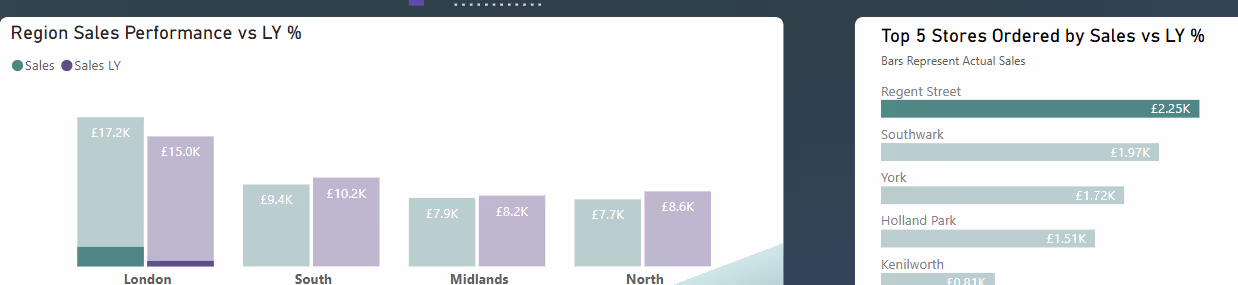
Cross-Highlight Example
Now let’s look at a cross-highlighting scenario. In this case, we select “Regent Street” from the “Top 5 Stores” visual. The other bars grey out and visuals across the page subtly shift, not by filtering, but by highlighting the portion of data related to Regent Street.
Notice how the “Region Sales Performance” column for London is partially shaded to show only the sales tied to Regent Street. The rest of London’s data stays visible, providing important context. Now, if we had filter option here, we’d only see the single region of London (since Regent Street is located there) - not as helpful!
Best Practices for Power BI Visual Interaction Behaviour
When it comes to using configuring the interactions, here are five best practices I would promote from my years of experience:
Always Review Interactions Before You Publish:
Don’t just rely on default interaction behaviour and hope for the best. Before deploying a report, select some visuals, test each visual, make a few selections and review how the rest of the report responds. Some visuals work best with Filter, others with Highlight and sometimes the right move is None. Make the interaction setup a standard part of your deployment checklist.
Think Like Your End-User:
When choosing the interaction type between two visuals, ask yourself, what would the end-user expect here? What insight are they trying to gain? What would benefit them? One of the examples earlier in this blog shows how simply switching from Filter to Highlight made the insight clearer and more useful. It’s small decisions like this that make a big difference in usability.
Avoid Overcomplicating the Experience:
Just because you can link every visual to every other visual doesn’t mean you should. Too many interactions can create noise and confusion. Keep things purposeful, make sure only the visuals that truly need to respond to a selection actually do.
Don’t Just Hand It Over - Explain It:
I started this blog with a common scenario: “Why has that number changed?” or “This chart looks broken!” This happens all the time when users aren’t familiar with how interactions work. Take a few minutes to demo it. Show them what cross-filtering and cross-highlighting do as it will save you headaches later.
Be Aware of the Performance Impact:
Every time a user selects a visual and an interaction kicks in, a new query is generated in the background. With that said, be mindful as in large, complex reports or with DirectQuery, these interactions can add up. While they don't instantly cause major issues, just know they exist and monitor performance if you’re layering lots of them.
Query Reduction Option
I briefly mentioned this above, but if your Power BI report is using DirectQuery it's important to pick up on this. Every interaction, like selecting an option from a filter or a slicer, selecting a visual element and yes... triggering cross-filtering/highlighting, sends a query to your data source. Now imagine hundreds of users clicking around... that's a lot of load on your backend.
Below is the options window, which you can go to by selecting File > Options and settings > Options and then going to "Query Reduction" under the CURRENT FILE section.
Notice the option right at the top "Disabling cross highlighting/filtering by default". This is what I wanted to call out, as it lets you turn off visual interactions by default.
So, to be clear, I’m not saying you should disable visual interactions. As discussed throughout this blog, this feature is incredibly useful when used intentionally. It helps end-users explore their data more effectively and uncover valuable insights. However, when working with DirectQuery, it’s important to be aware of the performance impact visual interactions can have. I could easily write an entire blog just on that topic, so if you're interested, let me know!
IMPORTANT NOTE: At the time of writing, the "Disable cross highlighting/filtering by default" option under Query Reduction doesn’t appear to be working as expected. There’s an open thread about this on the Microsoft Fabric Ideas page which you can see here, and I’ll make sure to update this blog once a fix is confirmed or more clarity is provided.

Final Thoughts
You should now feel comfortable navigation how different visualisations interact with each other. Cross highlighting and cross filtering really are a great freature to take advantage of. But remember, it all comes down to intention. Don’t leave interactions to default behaviour, configure them correctly. Test them, tweak them and design them around how your users actually think.


.avif)
.avif)
.png)