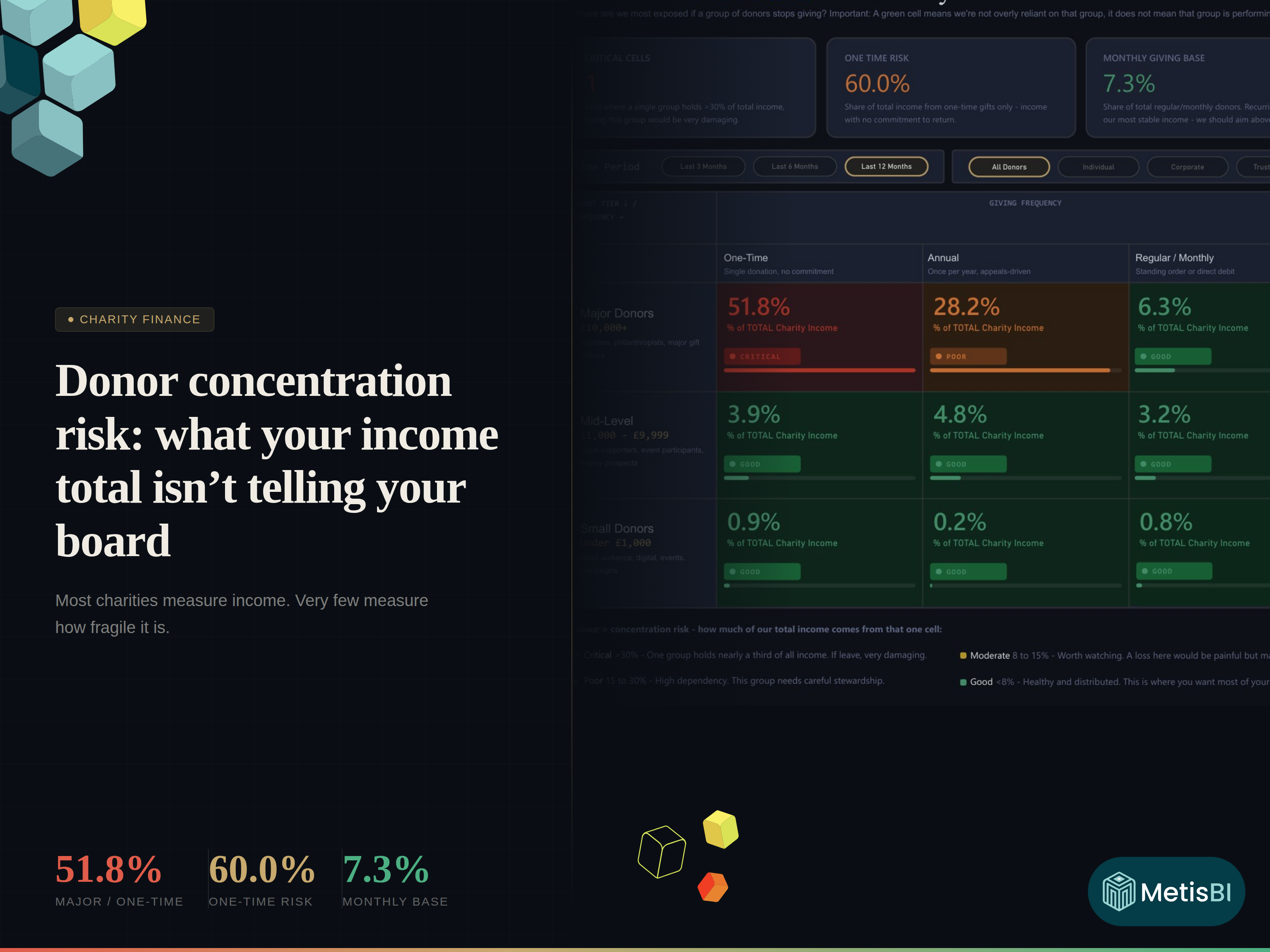


Most charities can tell you what came in last month. Far fewer can tell you how fragile that income is. Here is the thing, you can look stable in an annual report and still be one resignation, one budget cut or one donor change of heart away from a bad year. That is not pessimism, it is just how concentrated income behaves.
Summary
Donor concentration risk is the exposure created when a large share of your charity’s total income depends on one narrow donor group or giving pattern. It is not about whether donors are "good" or "bad". It is about what happens to your financial plan if a single segment stops giving. A charity can hit its income target and still be financially fragile if that income is overly concentrated.
See how it works for yourself. The interactive report below lets you explore donor concentration across segments, toggle between time periods and giving frequencies to see where the risk sits.
Key takeaways
- A healthy income total can hide unhealthy dependency.
- One-time gifts can look like growth while quietly increasing fragility.
- A green segment does not mean "performing well". It means "not overly relied on".
- Your board should be able to answer three concentration questions in one minute.
- If you cannot explain dependency in plain English, you cannot manage it.
The annual report illusion
I've seen this a few time now. A finance lead shares headline income, a fundraising lead shares campaign results, everyone nods and the board moves on. But those numbers are totals. Totals do not tell you whether your income is distributed or stacked. Think about it. Two charities can both raise £1m:
- Charity A gets £1m from hundreds of repeat givers across multiple channels.
- Charity B gets £1m, but half of it comes from one-time major gifts.
Same total, but completely different risk profile and the worst part is that the fragility is usually invisible until the moment it bites.
Three questions your board should be able to answer instantly
This is less of a nice to "nice to have". These are governance basics.
- What percentage of our income is one-time only?
- Which single donor group holds the highest dependency?
- What does our recurring base actually look like?
If you cannot answer these without a follow-up email and a spreadsheet scramble, you are flying blind.
What concentration risk means in charity terms
Concentration risk is simply this: if one segment of donors stopped giving, how much of your total income would disappear? So, it is not about blaming a segment. It is about understanding exposure, so you can plan for it.
Red does not mean "bad donors". Red means "if this group stops, the drop is immediate and painful".
Green does not mean "we are doing brilliantly". Green means "we are not overly reliant on that segment, so a shock here is manageable".
That nuance matters, because most teams read green as success and stop asking questions.
A real example that changes the conversation
Hold on… let me put some numbers on this.
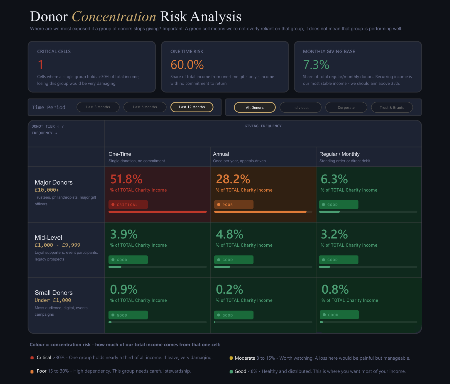
In a the solution we we built below, 60.0% of total income came from one-time gifts one specific segment stood out. Major donors giving one-time gifts represented 51.8% of total charity income.
Read that again. More than half of total income, tied to donations with no standing order, no direct debit and no commitment to return next year. That does not mean major donors are a problem.
It means the charity’s plan is fragile if stewardship slips, if a trustee changes, if a family foundation switches priorities or if one relationship cools.
In practice, this shows up as:
- A "great year" followed by a sudden cliff-edge.
- Short-term hiring or programme expansion that becomes impossible to sustain.
- A board that is optimistic because the total looks healthy.
- A team that is stressed because everyone knows the renewal is not guaranteed.
This is exactly why concentration risk needs to be visible, not buried in someone’s head.
What a charity fundraising dashboard should show about income dependency
By the time a board asks "are we too dependent?", you need an answer on one screen. This is the structure that makes it readable to non-technical stakeholders.
The matrix structure in plain English
- Rows are donor tiers: Major, Mid-Level, Small.
- Columns are giving frequencies: One-Time, Annual, Regular/Monthly.
- Each cell shows the percentage of total charity income that comes from that combination.
That is the whole trick. It turns a complex income mix into something you can scan in five seconds.
Side note: I deliberately left out the £ values in this demo view, because the point here is dependency.
What each cell means as a business decision
Do not treat the cell as a number. Treat it as a decision prompt:
- A high percentage in Major/One-Time could be a stewardship and pipeline question.
- A high percentage in Major/Regular could be a resilience asset you protect.
- A growing Mid-Level/Regular cell could be best long-term signal.
- A weak Regular/Monthly base is not just a marketing problem. It is a sustainability problem.
Colour logic in business terms
The colour is concentration risk: how much of total income sits in that single cell.
- Red means "a shock here hurts immediately".
- Amber means "worth watching, because a loss would be painful".
- Green means "distributed enough that a loss is manageable".
Again, green does not mean performance, it means dependency is low.
Walking through one cell as a story
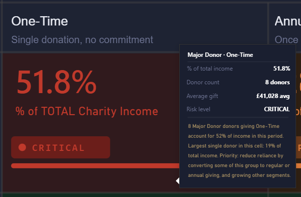
Take the Major Donors/One-Time cell at 51.8%. What does that mean on Monday morning? It means your budget depends on people with no recurring commitment to give again.
Now zoom in, when you hover that cell, the tooltip shows what sits behind the headline:
- Donor count: 8 donors
- Average gift: £41,028
- Risk level: Critical
- Largest single donor in this cell: 19% of total income
Think about that last line. Even if the wider "cell" problem is already uncomfortable, a single relationship inside it can be carrying a frightening share of the entire charity’s income.
It means your fundraising plan should include:
- A clear renewal and stewardship cadence for those relationships.
- A realistic "what if this drops by 20%" scenario.
- A deliberate shift of some of that value into regular giving where possible.
- A pipeline plan that does not assume last year will repeat.
And it means the board needs to understand that "we raised more" and "we are safer" are not the same sentence.
The three numbers a board needs at the top
This is why the KPI cards matter. They cut through everything:
- Critical Cells: how many cells are holding a dangerous share of total income.
- One-Time Risk %: how much of total income is coming from one-time gifts.
- Monthly Giving Base %: how much of your regular donor base exists today.
In the example below, the Monthly Giving Base is 7.3%.

If you are reading that and thinking “that is low”, good. That is the point. You can be successful and still be exposed.
Common mistakes charities make with this topic
- Treating concentration as a fundraising-only issue. It is a governance issue.
- Confusing stability with size. Big gifts are not stable by default.
- Overreacting to red by blaming a segment, instead of managing exposure.
- Reading green as "good performance", then ignoring under-performance inside a green cell.
- Reviewing this once a year, usually at year-end, when options are limited.
Where Metis BI fits in
Here is the thing. Most charities already have the data needed to answer these questions. It is just not organised in a way the board can read.
We help charities build reporting solutions that offer high value, not another report that looks nice for two weeks and then gets ignored.
We do that through our proven storytelling methodology. We start with the board-level questions, we define what “good” looks like in plain English, and we build the solution around decisions, not visuals. It is tried and tested across multiple charities and other organisations. When the data is the blocker, we can help there too. Correct ingestion and modelling techniques are what make these insights reliable, refreshable, and safe to scale.
If you are heading into year-end, or you have had a “good year” and you want to know whether it is repeatable, get in touch and we can show you what your income looks like through a concentration lens. See our dedicated reporting page here: Design Microsoft Power BI Reports with Purpose.


.png)

.avif)