


Updated January 2026: This article has been refreshed to reflect the latest Copilot capabilities in Power BI. Since originally published in July 2023, Microsoft has significantly expanded Copilot features across Desktop, Service, and Fabric. Core concepts and persona-based approaches remain relevant.
If you're looking for a practical guide on getting your Power BI environment Copilot-ready, read our recent deep dive: Is Your Power BI Copilot Setup Business Ready?. For this blog below it focuses on how the three Power BI personas: Model Designer, Report Author and Report Consumer, can leverage Copilot in their day-to-day work.
High-Level Overview of the Three Personas
- Model Designer: Responsible for ingesting data, applying relevant transformations, modelling, and creating DAX.
- Report Author: Responsible for gathering reporting requirements, creating reports, choosing the right visuals, and publishing.
- Report Consumer: Have no authoring needs, they are pure report consumers, accessing and analysing reports.
One additional persona worth noting is the Power BI Service Administrator (now Fabric Administrator). From a Copilot perspective, it's less relevant here hence won't dive into it, but if you're planning training or identifying roles across your organisation, don't overlook this one. For more on training the different personas, see our blog: What Is Power BI Training?
1. Copilot for Semantic Model Designers
Now, let’s explore how each of these personas can use Copilot, starting with the Model Designer. It’s worth noting that in many organisations, individuals often hold more than one of these personas.
Quick Measure – Suggestions with Copilot
When it comes to designing and creating the semantic model in Power BI, I say creating the DAX formulas is the responsibility of the model designer. For this reason, the “Suggestions with Copilot” feature within the Quick Measure functionality is particularly relevant to these designers.
It’s important to note that Quick Measure is not a new feature introduced with Copilot. It existed well before Copilot was made available. However, with its introduction, the Quick Measure option now includes a new feature called “Suggestions with Copilot.”
By the way, to access this, ensure that Copilot is enabled in your Fabric environment. I won’t cover the configuration process in this article as there are so many resources available to help you get started with enabling Copilot.
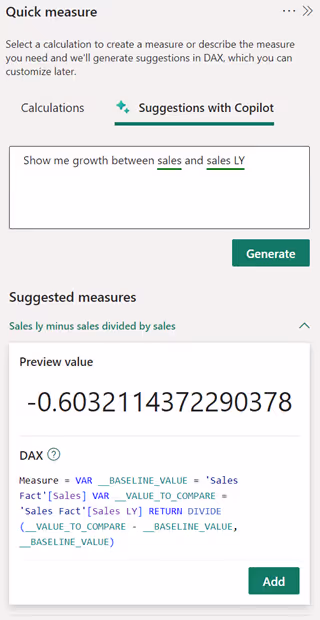
Below is an example of me using this feature to calculate the “Sales vs Sales LY Variance %.” This is to compare the current year performance against last year. So, I typed in “Show me growth between Sales and Sales LY.”
Also, below is the DAX in a more readable format:
While the above was close to what I wanted, I was hoping for the DAX to be: (Sales – Sales LY) / Sales LY. Since I asked, "Show me growth between Sales and Sales LY," I interpreted this as showing how Sales has changed compared to Sales LY.
However, I achieved the desired result by simply changing the prompt to: “Show me growth between Sales LY and Sales.”
The above example is for just one simple measure. I’ve experimented with this feature for a while, not just for writing this article. My recommendation is to use Suggestions with Copilot as another tool in your DAX-writing toolbox. However, don’t rely solely on the DAX it generates without inspecting it closely and running some tests.
DAX Query View
Let's now explore another way Copilot can be used by the model designer. To showcase this, we will dive into the DAX Query View. If, like me, you have been using DAX Studio for a while, this view may seem a tad familiar.
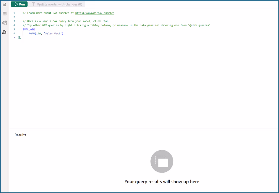
So, where is Copilot? Well, if you look closely at the above screenshot, you can spot the Copilot icon on row 7. Also, in the Home Ribbon for the DAX Query View, you'll find the "Copilot" button.
I'll delete the sample DAX that Power BI places in the query view and start Copilot. Once I do this, I'm presented with the following:

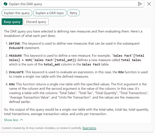
As a model designer, I would say the three options offered above would be helpful for me. After all, from my experience, many users who fall into this persona find DAX to be the hardest part of the job. Let's try out the first option, "Suggest measures," and see the result:
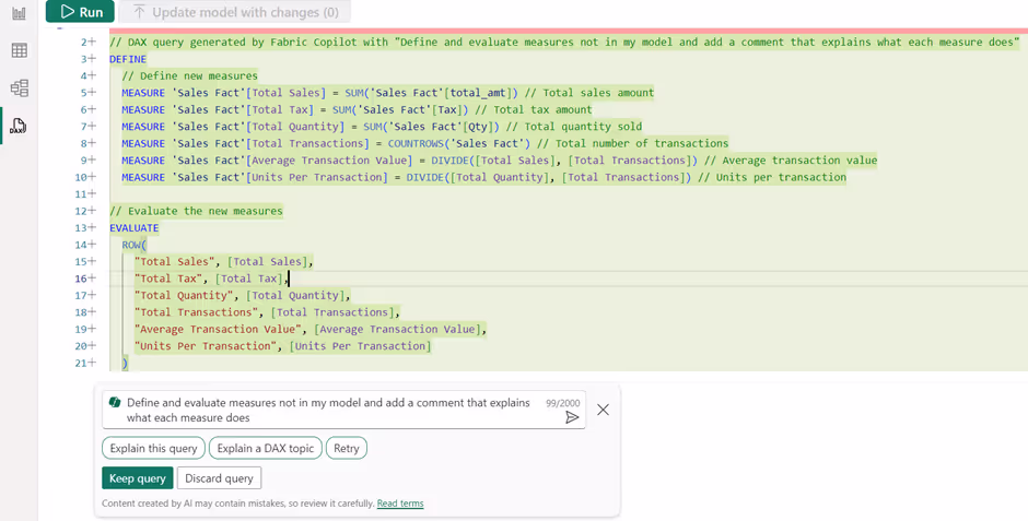
So, what has the above done? Well, it has attempted to “define and evaluate measures not in my model.” However, I already have many of these measures, but they are simply named differently. For example, it created Total Sales, equivalent to my Sales, and it created Average Transaction Value, equivalent to my ATV, etc. For someone who has not created any measures, I can see this being a helpful starting point.
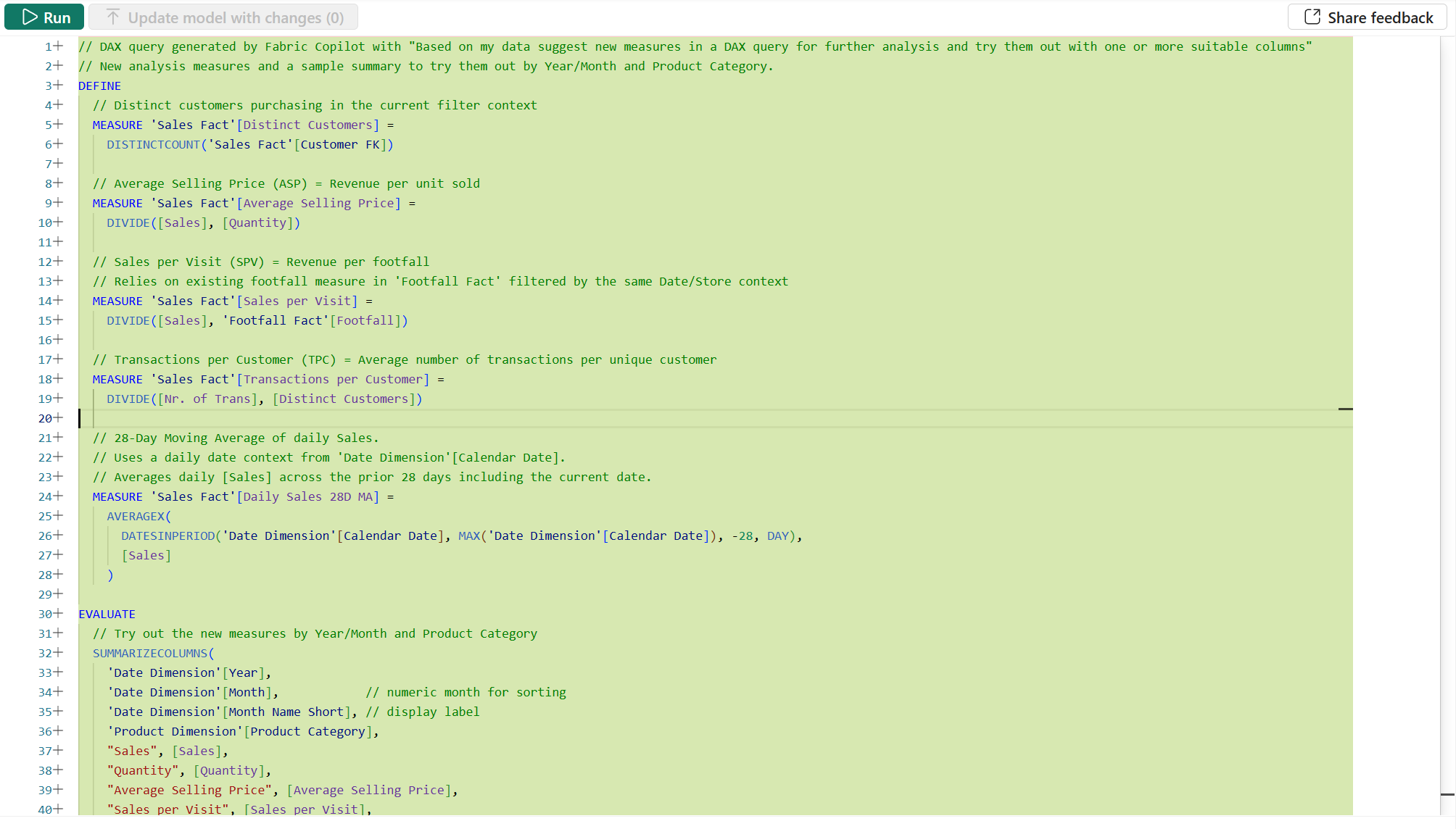
As you can see in the screenshot above, running the same prompt today produces noticeably better results. Note: this was tested on a different semantic model, but the result is still insightful. Rather than recreating basic measures I already had (or just with different names), Copilot now suggests more advanced/helpful measures I hadn't built, things like Distinct Customers, Average Selling Price, Sales per Visit and even a 28-Day Moving Average. So, the suggestions have become more contextually aware and genuinely useful as a starting point.
Moving on, notice Copilot now offers the option to "Explain this query," which I really like. I know this will prove helpful to various people who need to write DAX and understand how the calculation is made. This experience has also improved - the output now formats each measure with clear headings, concise descriptions, and DAX shown in a code block style, making it cleaner and easier to scan.
Let's try selecting another option this time. So, I will discard what I currently have above, and this time I will select “Write a DAX Query” and then select “Explain this query.” We get the following result:
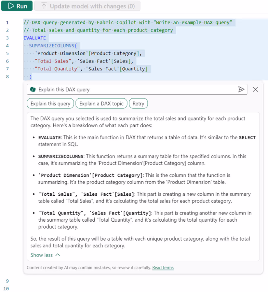
I guess the first thing worth calling out is that when selecting “Write a DAX Query,” the results are random. I pressed this multiple times, but the result was more or less always the same. So, was this very helpful? Not very much. That said, testing this again today (2026) shows more variety - pressing "Write a DAX Query" now generates different options each time, which is a step in the right direction.
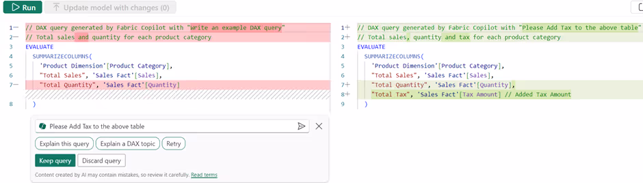
I then asked Copilot to “Please add Tax to the above table,” and I was presented with the following. I found this to be pretty cool. I like that it helps users see the difference in what's being changed.
Add Synonyms for Q&A
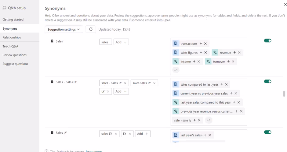
Another way model designers can leverage Copilot is through the Q&A visual. I mentioned this on LinkedIn previously. Initially, I thought the Q&A visual might be revamped to rely on generative AI, but that’s not the case. Instead, Copilot enhances the Q&A feature by effortlessly adding synonyms to my tables, improving its understanding of user questions. In the screenshot below, you can see the suggested synonyms marked with a green icon.
It's worth noting that Microsoft has since confirmed Q&A and its setup tooling is retiring by December 2026. Synonyms remain essential for Copilot accuracy, but the approach has shifted to the Properties panel in Model view. For a deeper dive into synonyms and preparing your semantic model for Copilot, see Is Your Power BI Copilot Setup Business Ready.
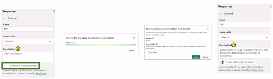
Descriptions for Measures
To wrap up, another important task for model designers is adding relevant descriptions to tables, columns, and measures. I recently posted about this as well, since I always include descriptions for all my tables, measures, and columns. Why? I export the metadata using DAX Studio to create a data dictionary solution. Additionally, I appreciate that the tooltip displayed when hovering over a measure includes its description.
With Copilot, much of this process is now automated at the click of a button. I’ve tried this a lot, even switching full names to abbreviations and other naming conventions, and it consistently provided reasonable descriptions that I was happy to use. My only complaint is that this feature is currently available only for measures.
2. Copilot for Report Authors
So, above, we’ve explored four ways model designers can use Copilot to assist with their development. Now, let's look at how report authors can benefit from Copilot in Power BI.
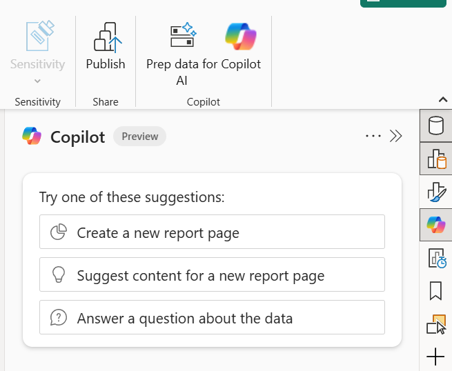
Copilot in Desktop
In Power BI Desktop, we have the lovely “Copilot” button standing tall alongside the “Publish” button. Once we select this, we see a new pane – yes, more panes. Below, you will see we have two options that Copilot is offering us. Additionally, we can simply go ahead and type out what report we want or the question we need help with.
On a side note, looking at this, some might think, "Will AI replace the report developer?" Well, I won't go into detail over this, but I have previously posted about it on LinkedIn, so check out my thoughts there.
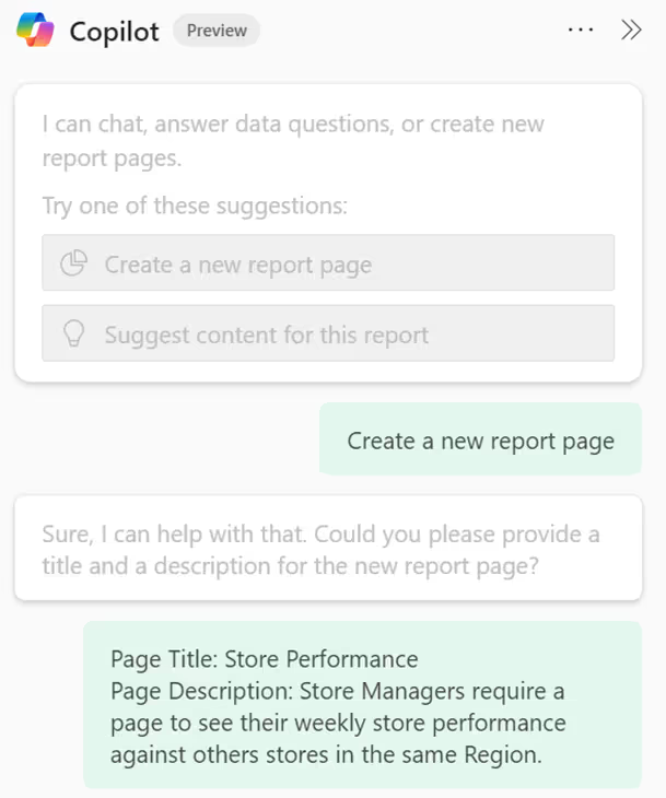
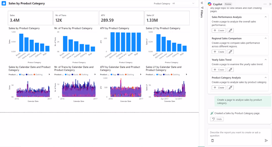
I first selected “Create a new report page.” Copilot asked for some additional information, which is fair, I would say. After all, we can’t complain it’s a bad result if we don’t give it some context. We can complain afterward, though. I also provided the answer below.
Below, we can see the result Copilot came up with.
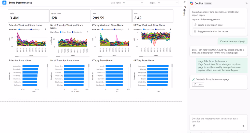
In all honesty, it did offer a report page that showcases store performance compared to other stores within the same region. If I were a store manager, I could select my region and see all stores, including my own. It also gave me the core measures within this semantic model, a breakdown by time period, and a breakdown of stores by the core measures. I also liked that it stacked/ordered the visuals into columns by Sales, Number of Transactions, ATV, and UPT.
Some things I didn’t like about this? Well, I don’t know if sales of 3.4M is good or bad, so a KPI visual would be better. The area chart is not readable, and there is no filter to select Year/Month/Week. It looks too busy, so maybe field parameters or bookmarks could be used for the end user to select the core measure and have one area chart visual and one clustered bar chart. I can find lots of things wrong, but at the same time, I think it offers a good starting point and some inspiration, especially to those who are new to report authoring in Power BI. However, as I previously posted, will this only get better? Absolutely – I feel like it will. Having run multiple tests since, I'm not seeing much better outcomes here directly, this remains an area to watch rather than rely on.
Continuing with Copilot in Desktop for report authors, I now selected “Suggest content for this page,” as you can see below. Notice it offers a few suggested options for other pages, and I have selected “Product Category Analysis.”
Notice, it kept the same structure as before. However, this time I have a few more issues with it - not very helpful. However, I did also have the option to “Edit this content suggestion”.
Hopefully, the above gives us a good idea of how Copilot in Power BI Desktop can be used for report authors.
One addition since first blogging about this, as of now 2026, we have the ability to choose specific skills for Copilot to use in the chat, such as answering questions about the data, analysing report visuals or creating new report pages, which helps get more targeted assistance on what you actually need. See the screenshot below:

Copilot in Service
Let’s now see how a report author can take advantage of Copilot, but this time in the Power BI Service/Fabric portal.
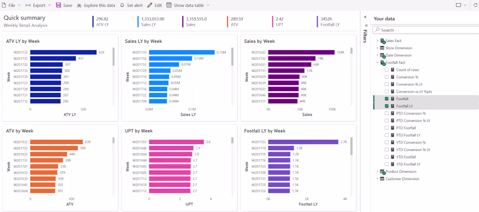
For this one, we will select the semantic model for the report I have been showcasing, "Weekly Retail Analysis." I will select "Explore this data," followed by “Auto-create a report.” Notice below, it does call out that Copilot will offer the best results if we pre-select the data that we are most interested in.

So, below you can see the result after I selected some of the core measures and their equivalent LY comparisons, the week for the time period, product category, and store. Its safe to say for now, we will still be in a job - for now 😊
3. Copilot for Report Consumers
To finish up, let's explore how Copilot can be used for Report Consumers in Power BI. However, I first want to mention that I previously wrote an article, “Exploring the Narrative Visual with Copilot.” It’s definitely worth a read and provides another way for report consumers to get some exposure to Copilot.
Here, I will focus on using the Copilot panel when viewing a report in a Power BI App. That's right, an App, not a workspace - the best place for report consumers to view their reports 😊
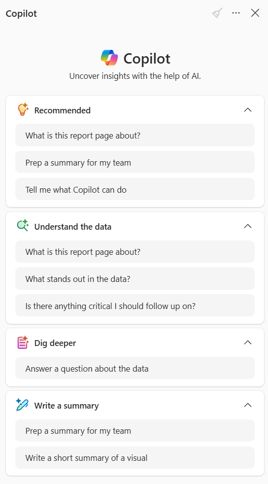
Since this article was first written, the Copilot panel has expanded significantly. When you open it within an App, you're now presented with structured options to guide your interaction:

- Understand the data: Ask what the report page is about, what stands out, or flag anything critical to follow up on.
- Dig deeper: Answer specific questions about the data.
- Write a summary: Prep a summary for your team or generate a short summary of a specific visual.
These guided prompts make it far easier for report consumers to get value without needing to know exactly what to ask. One thing I still appreciate is the reference tags in the output, they point to the visual the insight came from, so users can verify and explore further.
You'll also notice there's now a Copilot button directly in the App navigation (underneath the App name). This opens what Microsoft calls "app scoped Copilot", a full-screen experience where you can find reports about a topic, prep summaries or answer questions about data, all scoped to items within that specific App. It's worth noting there's a similar standalone Copilot experience available from the Power BI Service home page, but the key difference is scope: the one in an App points only to items within that App, while the standalone version on the Service home has access to reports, semantic models and agents across all workspaces you have access to. For more details, see Microsoft's documentation on Copilot for Power BI apps.
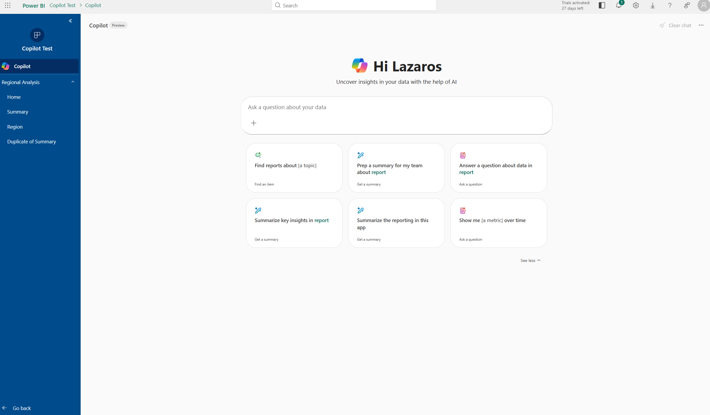
There's also report scoped Copilot, which is what you get when you open the Copilot panel while viewing a specific report. Unlike app-scoped Copilot which can search across all items in the App, report-scoped Copilot focuses only on the report you're currently viewing, useful when you want targeted summaries or answers without pulling in context from elsewhere.
Summary
Power BI Copilot offers valuable functionalities for model designers, report authors, and report consumers, simplifying tasks like DAX queries and preparing semantic models for AI. Is Copilot perfect on all fronts? Not at all. However, in my opinion, it will only improve over time.
If you have any other ways Copilot can be used by the above personas, feel free to share your insights!


.png)
.avif)
%20(8).png)