.png)


What is the difference between a slicer and a filter in Power BI? Is a slicer just a filter with more capabilities or are they actually different?
It is a question I still get asked regularly.
And it makes sense. The terms are used interchangeably in conversations. People say "add a filter" when they mean slicer. Others say "use a slicer" when they really mean report-level filter.
So let's clear it up properly. By the end of this blog, you'll know exactly when to use each and why it matters for report design, user experience and even performance. In this article, we will answer:
- What is a slicer in Power BI?
- What is a filter in Power BI?
- Is a slicer a type of filter?
- When should you use a slicer vs a filter?
- What is the difference between a slicer and a filter in your reports?
What Is a Slicer in Power BI?
A slicer in Power BI is a visual element placed directly on a report canvas that allows users to filter data interactively. So, it’s standalone visual you drag onto the page, assign a field to, and it immediately becomes an interactive filtering control for the user.

In the image above, taken from our Metis BI Healthcare Reporting Dashboard solution, you can see slicers placed directly onto the report canvas. Take the hospital "Ward" as an example. It is simply a text column with values such as AMU, ED, Gen Med and Surgical. But even with something straightforward like that, you have design choices. You can display it as:
- A traditional list with checkboxes
- Tile style buttons
- A compact dropdown
Now look at the Date slicer in the same example. Dates behave differently because they are continuous fields. When you use a date column in a slicer, Power BI automatically enables additional options. In the example, you can see:
- A list of individual dates.
- A "between" slicer with a slider.
- A relative date slicer such as "Last 1 week".
Just a quick note, this blog focuses on slicer vs filter. If you want a breakdown of the different slicer types: Slicer, Button Slicer, List Slicer and Text Slicer, I have covered that in a separate blog: Difference Between Power BI Slicers. Here, we are answering the bigger question: how slicers differ from filters in Power BI.
What Is a Filter in Power BI?
A filter in Power BI is the a core way we have to restrict what data appears in a visual, a page or an entire report. Unlike slicers, filters are configured in the Filters pane rather than placed directly on the canvas.

In the first image above, you can see the Filters pane in its default state. When no visual is selected, Power BI shows:
- Filters on this page
- Filters on all pages
These are your page-level and report-level filters. If you add a field under "Filters on this page" every visual on that page will respect it. If you add a field under "Filters on all pages" every page in the report will respect it.
This is typically where developers apply structural logic. For example:
- Excluding archived records.
- Locking a report to a specific business unit.
- Removing unwanted categories from the entire report.
Now look at what happens when you click on a visual.

The Power BI Filter Panel now supports three main filter scopes:
- Visual-level filters: affect only a single visual
- Page-level filters: affect all visuals on that page
- Report-level filters: affect every page in the report
This often confuses people in our Power BI training, sometimes they see three filter levels in the Filters pane, other times only two. The reason is simple, the pane is dynamic. If no visual is selected, you only see page-level and report-level filters. As soon as you click on a visual, a third section appears at the top, visual-level filters, which apply only to that specific visual.
Is a Power BI Slicer just a Filter?
From a technical perspective, a slicer is just applying a filter. When you click a value in a slicer, Power BI filters the relevant section of the report. So technically, yes, a slicer is simply filtering.
However, in usability, behaviour, report design, they serve different purposes.

Where Slicers and Filters Really Differ in Practice
As mentioned earlier, slicers apply filters. But in terms of usability, behaviour and report design, they serve very different purposes. This is where the distinction becomes important, so let’s look at how they differ.
Top N Filtering Only Lives in the Filter Panel
One capability slicers do not offer is Top N filtering. Believe me, if you can use this instead of DAX, do it! Inside the Filters pane, you can switch a field to Top N mode and define ranking logic based on a measure. For example, you can show:
- Top 5 products by revenue
- Top 10 wards by admissions
- Bottom 3 regions by conversion
This is not simple selection. It is logic-based filtering driven by a measure that determines ranking. Slicers cannot do this. They allow users to select existing values, but they do not evaluate ranking logic. Filters, on the other hand, can apply measure-driven rules. That capability lives in the Filter Panel, not on the canvas.

In the image above, you can see a clear before and after example of Top N filtering in action. On the left, the chart shows all wards sorted by used beds. Nothing has been restricted. Every category appears and the visual reflects the full data.
On the right, a Top 5 filter has been applied using the Filter Panel. The field has been switched to Top N mode and configured to show the top five wards by the Used Bed measure. The result is a focused view that highlights only the bays in a ward that are busiest.
Again, we cannot do this in a slicer. Yes, we can manually select five wards, but it would not dynamically calculate and return the top five based on a measure. Another important point, the measure used for ranking does not have to be the same measure displayed in the visual. You can rank by one measure and show another.
Advanced Filtering (Condition-Based Logic)
The Filters pane also supports Advanced filtering. This is where you can stop "selecting values" and start applying actual conditions.
- For text fields: contains, does not contain, starts with, is blank, is not blank, etc
- For numerical fields: is less than, is less than or equal to, is greater than, etc.
This is an advantage of the Filter Panel. You are not picking from a list, you are defining logic. So if you need something like "Ward contains Med" or "Department is not blank", this belongs in the Filters pane.
Now, small nuance because Power BI keeps evolving. The newer Text Slicer can replicate part of this experience, but only the "contains" style behaviour. It is essentially a user-friendly search that filters to values containing the typed text. But, it does not give you the full Advanced filtering options. As mentioned above though, this is focused purely on filter panel and standard slicer.

Syncing Slicers Across Pages
This is a big difference that the Filter Panel simply cannot replicate. With slicers, you can sync one slicer across multiple pages. That means you can build a single "Ward" or "Date" slicer once, then choose exactly which pages it should control. You can even hide it on certain pages but keep it active, so the selection still applies in the background. Filters do not work like that.
In the Filter Panel, scope is fixed. A filter is either:
- Visual-level: one visual
- Page-level: everything on that page
- Report-level: everything on every page
So what happens when you want something in-between? For example, imagine a report with five pages and you only want the "Ward" selection to affect Pages 1, 2 and 4 but not 3 and 5. The filter panel cannot do that cleanly. It is all or nothing at the report level or page by page if you manually copy logic everywhere.
Slicer syncing solves that. It is about designing how a report behaves across pages, without forcing you into "page" or "all pages" as the only options. In the screenshot below, you can see the Sync slicers pane in action. The same slicer can be applied to specific pages (for example Capacity Overview and Ward-Level) without forcing it onto every page in the report. This is a big one, the Filter Panel is for visual, page or all pages, but slicer syncing gives you the "in-between" option that filters simply cannot do.

Placement and Experience
This is another big difference between slicers and filters. As mentioned earlier, the Filters live in the Filters pane. That is it. Useful, but it is always "off to the side" and it rarely feels like part of the report experience. Side note, you can also hide the elements of a filter panel or the entire filter panel. Also, lock the filter cards whilst keeping them visible or simply just lock them and not have them visible. This is a cool feature that I quite like about the Filter panel.
Slicers though can live anywhere on the canvas, which means you can design the filtering experience, not just add filtering. You can place slicers in headers, build them into navigation or tuck them into a sidebar so the report stays clean but still interactive. Also, once you combine slicers with bookmarks and buttons, you can go one step further and build a proper "slicer panel" experience. Think of it like a slide-out filter drawer the user opens when they need it, then closes when they want to focus on the visuals.
The screenshot of the Metis BI Healthcare Bed Capacity page shows a left-side "Filter Panel" experience with Ward, Bay Name and Date slicers embedded into the sidebar. These are slicers, not the filter panel.

The screenshot of the Regional Retail Summary Analysis page shows the filter panel opened from the top-right, with Date, Product, Location slicers inside it.
Side note, If you want to build this yourself, I have a short walkthrough video here: Sleek Navigation Panel for Power BI.

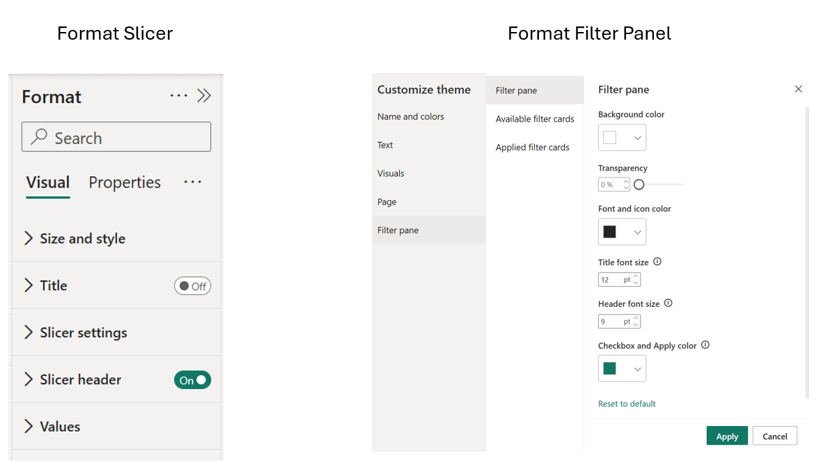
Formatting Flexibility
Slicers are visuals, so they come with the usual Format pane options. You can control things like layout, fonts, spacing, backgrounds and borders, which makes slicers much easier to design into the page. The Filters pane is different. You do not format individual filter cards in the same way. Instead, the look and feel is driven more by theme settings (and, if you want to go further, theme JSON customisation). So in practice, Slicers are more design-friendly, Filters are more structure-first. Below is a brief illustration of this.
Edit Interactions (Slicers Give You Finer Control)
Another big difference is Edit interactions. With slicers, you can decide exactly which visuals respond. Maybe the slicer should filter your main charts, but not your KPI cards. Maybe it should affect the trend line but leave a benchmark table untouched. That level of control is handled through Edit interactions and it is a big part of building reports that feel intentional rather than "everything changes all the time".
The Filters pane does not give you that kind of selective behaviour. Filters apply based on visual, page, report and that is it. If you want the full walkthrough, I have covered it properly here: How to Use Edit Interactions in Power BI - Control Visual Behaviour Like a Pro.
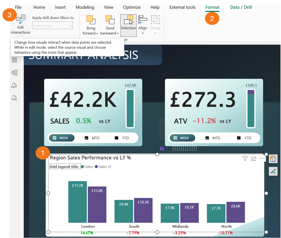
In the screenshot below, you can see where Edit interactions lives in Power BI Desktop. You select a visual first, then go to the Format ribbon and click Edit interactions. Power BI then lets you control what the other visuals do when that first visual is used, for example filter, highlight or ignore. The same concept applies to Slicers. A slicer is still a visual on the canvas, so you can use Edit interactions to decide exactly which visuals it should affect and which it should leave alone.
A Quick Detour on Slicer Types
I know I mentioned this a few times throughout the blog, but it would be wrong not to call it out again. Afterall, I am highlighting some differences between the Slicer and Filter panel. When people ask "slicer vs filter", half the time what they are really struggling with is that slicers themselves have evolved. We are not just talking about the classic dropdown and checkbox list anymore. Power BI now gives you different slicer experiences such as the Button, List and Text slicers, and that changes what people think a "slicer" even is. I am not going to deep dive here because this blog is about the default or standard slicer we always had vs filters. But if you want a clear breakdown of the different slicer types and when to use each, I have covered it properly in a separate blog.
One Last Note on Performance
On large datasets (especially DirectQuery), slicers can feel heavy because each click can trigger queries and refresh visuals. If that becomes a problem, use query reduction. Instead of adding an Apply button to every slicer (not recommended), add Apply all slicers so users can make selections first, then apply once. Also, if you want a checklist on all you need to do to have High Performing Power BI solutions, download our: Power BI Performance & Best Practice Checklist.
Summary
So, are slicers and filters the same thing? Technically, yes… both filter data. But in practice, they serve completely different purposes in report design.
Use slicers when:
- You want users to interact with filtering directly on the canvas.
- You need to sync selections across specific pages (not just "all" or "one").
- The filtering experience is part of the user interface, not hidden logic.
- You want full control over placement, formatting and visual interactions.
Use the Filter Panel when:
- You need Top N or Advanced filtering logic that slicers cannot replicate.
- You are applying structural filters (e.g. excluding archived records, locking to a business unit).
- Performance matters and you want filters applied before visuals render.
- You need to hide or lock filters for security or governance reasons.
The best Power BI reports use both, slicers for the interactive experience, filters for the structural logic underneath. Of course, it comes also down to what you are trying to achieve. Once you understand where each belongs, your reports stop feeling cluttered and start feeling intentional. If you found this useful, we have more resources on Power BI governance, report design and best practices. Or, if you are struggling with messy reports, unclear filtering logic or performance issues, let's talk. We help organisations like yours build Power BI solutions that scale without losing control.


.png)

.png)