.png)


Most sales operations teams already know who their best people are. That is not the hard part.
The harder question is this: when are those people actually present on the shifts, days and inbound windows that matter most?
That is where this dashboard changes the conversation. Instead of stopping at league tables and top performer lists, it shows coverage % by day and shift, then links that directly to commercial impact.
Summary
A top performer coverage dashboard in Power BI shows whether your highest-converting people are actually covering the inbound slots where performance matters most. It moves the analysis away from “who is best” and toward “where are we under-covered, what is the likely gap and what might that be costing us each month”. In other words, it turns performance analysis into scheduling intelligence.
Key Takeaways
- Knowing your top performers is useful. Knowing when they are absent from high-value inbound slots is far more useful.
- Coverage % by day and shift tells a stronger story than a basic top performer ranking.
- Three numbers usually change the conversation fast: critical slots, conversion gap and estimated lost conversions per month.
- Redefining the performance window to 30, 60 or 90 days can completely change who qualifies as a top performer and where the real risk sits.
Why Top Performer Dashboards Usually Miss the Real Issue
Here is the thing. A lot of dashboards stop at showing who converted best last month, who handled the most leads or who generated the most revenue. That is fine as far as it goes, but it does not answer the operational question the business actually needs and I find to be very common.
If your best people are concentrated into a few weekday patterns, but your inbound demand peaks elsewhere, you do not really have a performance story. You have a coverage problem.
That is exactly what this dashboard is built to surface. It looks at the presence of top performers across the schedule and shows whether the highest-value slots are properly covered or quietly exposed.
What the Dashboard is Really Measuring
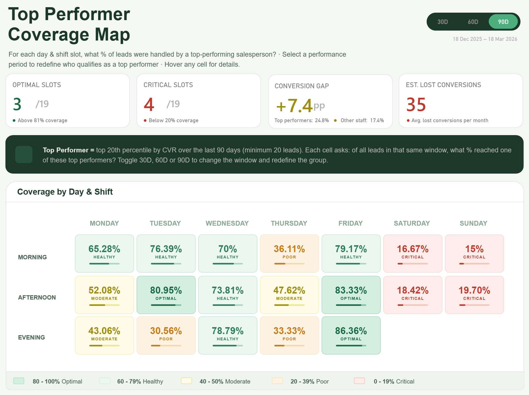
The core insight is not simply who performs best. It is coverage % by day and shift.
Think about it. If your strongest closers are heavily present on Tuesday afternoon but almost absent on Saturday morning and Sunday midday, that tells you something commercially important. Not because weekends are always bad, but because your highest-performing people are not there when inbound opportunities still exist.
This is where the visual becomes useful. Each cell in the matrix represents a day and shift combination, and the measure shows what % of that slot is covered by your defined top performer group. Straight away, weak areas stand out.
The three KPIs that matter
To keep this commercially grounded, the dashboard focuses on three KPIs.
Critical slots
These are the day and shift combinations where top performer coverage falls below an agreed threshold and the slot still carries meaningful inbound lead volume. This gives operations teams a list of where attention is actually needed, not just where colours look dramatic.
Conversion gap
This shows the difference between the benchmark conversion rate achieved by the top performer group and the rate delivered in under-covered slots. That matters because it shifts the discussion from staffing preference to measurable performance delta.
Estimated lost conversions per month
This is the commercial hook. Once you turn the gap into an estimated monthly number, the conversation changes completely. It is no longer “we should probably review weekend cover”. It becomes “this scheduling pattern may be costing us a material number of conversions every month”.
Why the 30/60/90 day toggle matters so much
One of the strongest elements in this dashboard is the 30, 60 and 90 day toggle.
Let me be clear: the definition of a top performer is not fixed. Change the performance window and you can change the entire picture.
A 30-day view may reflect current form, recent campaigns or short-term behaviour. A 90-day view may smooth out volatility and show a more stable benchmark. In some teams, that changes who qualifies as a top performer. In others, it changes which slots appear risky because the underlying benchmark shifts.
That is why the toggle is not a cosmetic extra. It is part of the analysis. If you select 90 days, it will show the lead allocation to the relevant day and shift slot, as well as derive the top performers dynamically based on the rolling 90 day period.
The Saturday and Sunday finding
The headline moment in this kind of reporting solution often comes when weekend coverage is isolated properly.
In this case, the Saturday and Sunday view becomes the wake-up call. Not because weekends automatically matter in every business, but because the dashboard can show that some of the most critical under-covered slots sit there. That is the moment where a sales leader stops looking at it as an interesting visual and starts seeing it as a scheduling issue with a commercial consequence.
There is more depth behind each cell than most people expect
This is not just a pretty matrix.
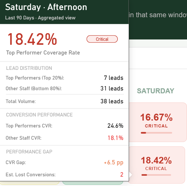
Each cell can be backed by tooltip detail that explains what is happening underneath. Hover over a slot and you can surface the actual coverage %, the top performer benchmark, slot-level volume, the estimated gap and the names or count of top performers contributing to that position depending on the design choice.
In workshops I run, this is usually the bit that lands well with operational stakeholders. They realise the dashboard is not asking them to trust a colour. It is giving them enough context to understand why the slot is being flagged and what to do.
Where this is especially relevant
This is not a universal fit for every reporting scenario, but it is highly relevant in a few environments.
1. Contact Centres
For inbound sales or service-to-sales environments, coverage gaps can sit quietly behind average daily performance. The issue is often not total headcount. It is where the strongest people are, and when.
2. Insurance and Lending
Teams dealing with inbound enquiries, quote requests or application handling often need a better view of when stronger conversion capability is present across the week. Small differences in conversion rates can mean a lot commercially.
3. Automotive dealership groups
Where leads are coming in across multiple locations or enquiry channels, this kind of view helps show whether the best-performing people are aligned to the windows with the highest opportunity.
Built natively in Power BI
Another important point is this is built natively in Power BI.
No template, no custom visuals, and certainly no AI-generated visual/image pretending to be a reporting solution.
The interaction and design are driven through native Power BI techniques such as DAX, create use of native visuals, a single SVG measure and button slicers. That matters because it keeps the solution grounded in the platform, maintainable by a real Power BI team and flexible enough to evolve as the business refines the logic. If you want to see how we can help with your Power BI Reporting needs, we have a tried and tested approach.
Why this matters now
Sales and inbound teams are under pressure to do more with the same headcount. That means scheduling decisions are no longer just an operations concern. They are a commercial one.
A dashboard like this helps teams move from broad performance reporting into something much more actionable. Not “who is good” or even “who is improving”. The better question is “where are we under-covered by our strongest people, and what is that likely costing us”.
If you are reviewing an existing sales or inbound reporting setup, this is exactly the kind of gap worth looking for. Some teams need a new dashboard from scratch. Others already have the data, but the current report is not asking the right question.
If that sounds familiar, Metis BI helps organisations assess the current reporting setup, challenge the logic behind the metrics and shape a Power BI solution that is actually useful operationally. This is especially relevant if you are rolling out a new inbound performance view or you already have a dashboard in place but it is not helping the business make better scheduling decisions.


.avif)
.png)