




I have seen Power BI reports that look fantastic. Just pure master pieces. They have clean layouts, nice colours, strong visuals and technically sound.
Then someone senior looks at it and asks, “So what?”.
And fair play to the person who asks that. Especially if they ask so what, and we can’t articulate why this solution was built, it’s usefulness, the audience it helps and actions it drives.
A Microsoft Power BI report can look impressive and still fail to help anyone make a better decision. It can use the right chart types, follow sensible layout rules, include polished icons and still leave the user unclear on what is happening, why it matters or what they should do next.
Now, before continuing this is very important so I want to be clear. This is not an anti-design blog.
I care a lot about report design. Good design matters. It improves initial adoption, creates excitement that feeds the adoption, builds trust, reduces confusion and helps people understand the message faster. Just check all previous blogs I’ve written over the years and I make this very clear.
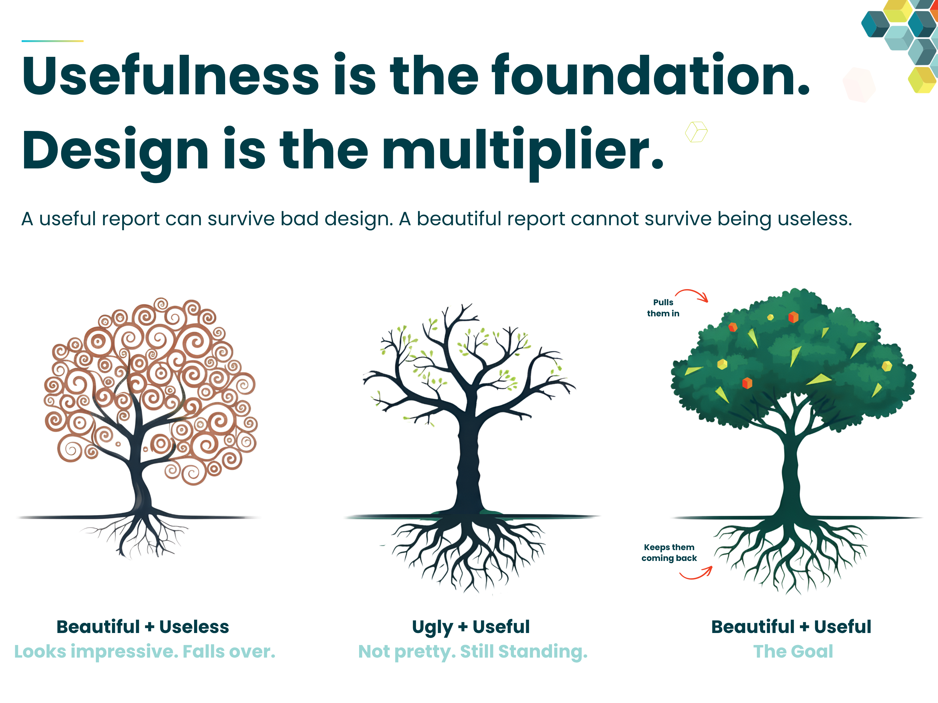
But here is the hard truth, design is not the foundation. Usefulness is the foundation. Design is the multiplier.
I have run 100s of workshops and built endless solutions for various organisations over the years. Many have succeeded and proud to say some have failed. From those failures came the real understanding of how to increase the likelihood of adoption and success. Also, from those failures I refined a methodology for gathering requirements, designing reports and developing solutions that work.
Summary
A useful Power BI report answers real business question, helps users move toward some form of objective or overcome some business challenge, it helps understand if they are moving toward it or away from it, it supports a decision and helps someone understand what action to take. Good design then makes that value easier to see, trust and use. The best Power BI reports are useful first and well-designed second. You start with the business value before the design, the same way you should start with the design before the development. It’s a naturally hierarchy and each level deserves its fair share of time.
- A useful report answers the right business question, not just any question.
- Good Power BI report design is not decoration. It guides attention and improves understanding.
- KPIs need context, such as target, prior year, budget, forecast or threshold.
- A useful but imperfect report is not the destination, but it proves the report has value.
- A beautiful but useless report is the trap.
Design is Not the Problem. Starting with Design is.
Here’s the thing... Most weak Power BI reports do not fail because someone cared too much about design. Not at all! They fail because the team started with the visual and design layer too early (or even worst, launched Power BI Desktop as the first step).
They went straight to Dribbble to get inspired. They discussed and focused on colours, layouts, slicers, icons, chart types, page structure, features before agreeing the basic fundamentals:
- Who is the report for? Genuinely, who will be using it?
- Is it a set audience with a shared purpose or all have different needs?
- Where is the audience of the report trying to go?
- Are they trying to achieve a business objective or overcome a challenge?
- What business questions should it answer?
- What action should the users be able to take?
- Which KPIs actually matter? Not nice to have, but genuinely impact?
- What context does the user need to judge performance?
When teams start with visuals and features, Power BI becomes a canvas for reporting output. When teams start with purpose, the process of building a reporting solution also creates business clarity. We see this all the time!! One of the most common pieces of feedback we get is "we have never had these conversations before" or "we should have these discussions much sooner".
That happens because we start by asking difficult questions to the right people. It naturally takes the conversation beyond reporting and into the business process itself. It helps remove ambiguity around definitions, terms and measures that are often being used interchangeably.
This is why I want organisations to think about reporting solutions as products, not technical outputs. Not “a dashboard we need to build”, but a product people need to use, trust and return to. That is a very different mindset.
AI to the Rescue!?
And here’s the thing, AI will not fix this. I said this before, and will say it again it will amplify the problem.
If an organisation does not understand its own definitions, terminology, processes and business logic, then the foundations for AI and LLMs are already weak. The output will only reflect that weakness back at speed. I've also discussed how speed should not be perceived as value alone also. But if you want more on that, check out this blog: Will AI Replace The Report Developer?
Think about it... if people cannot agree what "active customer", "qualified lead", "available stock", "margin", "utilisation" or "on-time delivery" actually means, what exactly is the AI meant to work with?
AI does not magically create business clarity. It relies on the clarity already built into your data, semantic model, measures, naming, definitions and processes. If those foundations are vague, inconsistent or disputed, the AI is not solving the problem. It is just giving confident answers on top of messy thinking. Same as always: Garbage In, Garbage Out.
So, What Makes a Power BI Report Useful?
A useful Power BI report helps a specific audience make sense of something important and guides them towards a destination. Not everything on the page needs to be dramatic. Not every visual needs to lead to a major decision. But the thing is, the report as a whole should have a reason to exist.
A useful Power BI report does not start with “what data do we have?” or “what do you want?”. It starts with the GOAL... a purpose! And by the way, for those who say but its a exploration report or a solution for ad-hoc deep diving analysis, well that is different!
For the GOAL... think what is the business trying to improve, protect, reduce or understand? Where are they trying to go? I always like to think its categorised into one of the below:
- Increase revenue
- Reduce costs
- Improve efficiency
- Improve quality
- Mitigate risk
- Improve compliance
- Reduce waste
Once the goal is clear, the report can focus on the right business questions. It stops you from creating the crazy, out of focus, trying to satisfy all needs in one canvas. Come on now... you know the ones I am talking about... we all built them before!
To offer some more guidance on this, below are some examples.
For a retail regional manager, the goal might be to improve store performance across their region. That could mean:
- increasing sales against target
- improving conversion and basket value
- identifying stores that need intervention this week
For a sales director, the goal might be to improve pipeline quality and revenue conversion. That could mean:
- increasing qualified pipeline coverage
- improving conversion from lead to closed won
- focusing attention on reps, channels or deals that need support
For a healthcare service manager, the goal might be to improve access, capacity and service performance. That could mean:
- reducing waiting times
- improving appointment utilisation
- identifying clinics, pathways or teams under pressure
For a manufacturing operations manager, the goal might be to improve production performance and reduce avoidable disruption. That could mean:
- increasing output against plan
- reducing downtime and defects
- identifying lines, shifts or machines causing the biggest loss
This is the point. A useful report starts with a real goal for a real audience. The report then works down from that objective into the KPIs, causes, context and actions that matter and directly impact it. This is the foundation I am talking about. Before design, before polish, before visuals, the report needs a clear goal, a clear audience and a clear reason to exist.
At the end, if no decision is being supported, you have to ask why the report exists. And at Metis BI, we do not accept "it’s for monitoring" as the final answer. Of course, monitoring matters. But monitoring only becomes valuable when a change in the numbers creates a need for someone to act, investigate, escalate or make a call.
I saw this in a real manufacturing example. The first answer was “it’s just for monitoring”. But after a bit of conversation, that was not true. If the report showed that a machine had stopped or was underperforming, an engineer needed to go to the factory floor, find the machine, understand the issue and help bring it back into production. That is not passive monitoring, that is a report supporting action.
That does not also mean every report needs a huge discovery exercise. But it does mean someone needs to be clear on why the report exists, who it is for, what it is meant to help them understand and what should happen when the numbers change.
Sometimes, going through that thinking makes you question whether the report should even be built in the first place. Good!! That is not wasted time. That is the work protecting you from building another good-looking report that nobody uses.
Without that foundation, design has nothing solid to multiply. You can refine the layout, hierarchy, chart choices, navigation and interactions, but none of it lifts a report that has no reason to exist.
Once the foundation is there, design becomes powerful. It makes the value easier to see, easier to trust and easier to use. That is why the order matters.
This is the approach we take at Metis BI when helping organisations design and develop Power BI reporting solutions. We start with the purpose, then shape the report around the decisions and actions it needs to support.
If you want to see how we help organisations build Power BI reports with a clearer purpose behind them, take a look at our Power BI report development services page. Or reach out if you want to understand more about the methodology we use to design reporting solutions people actually use.
From Foundation to Multiplier: Why Order Matters
So that is the foundation. The audience and goal are clear, the questions the report should answer make sense, the KPIs are the ones that matter and the decisions and actions behind them are real.
Now design starts to matter properly and where the order makes all the difference. Once a report has a reason to exist, design becomes a multiplier. And by design, I mean the full discipline like layout, hierarchy placement, chart choice, navigation, interaction, the things that decide how easily a brain can extract meaning from the page and so on. It takes the value the report already has and makes it easier to see, easier to trust and easier to act on.
Think about what a multiplier actually does. Multiply 10 by 10 and you get a 100. Multiply 0 by 10 and you still get 0. That is the bit that catches teams out. They throw design at a weak foundation and wonder why the report still does not get used. Of course it does not!! Design did its job. It amplified what was there, the problem is that there was nothing there to amplify in the first place.
Get the foundation right and design genuinely lifts the report. Get it wrong, and design just makes the failure look more expensive. This is why I keep saying: derive the story, then the dashboard. Not because design is unimportant, but because design only earns its weight when there is something underneath it worth lifting.
To make this concrete, here are the three types of Power BI reports I keep seeing.
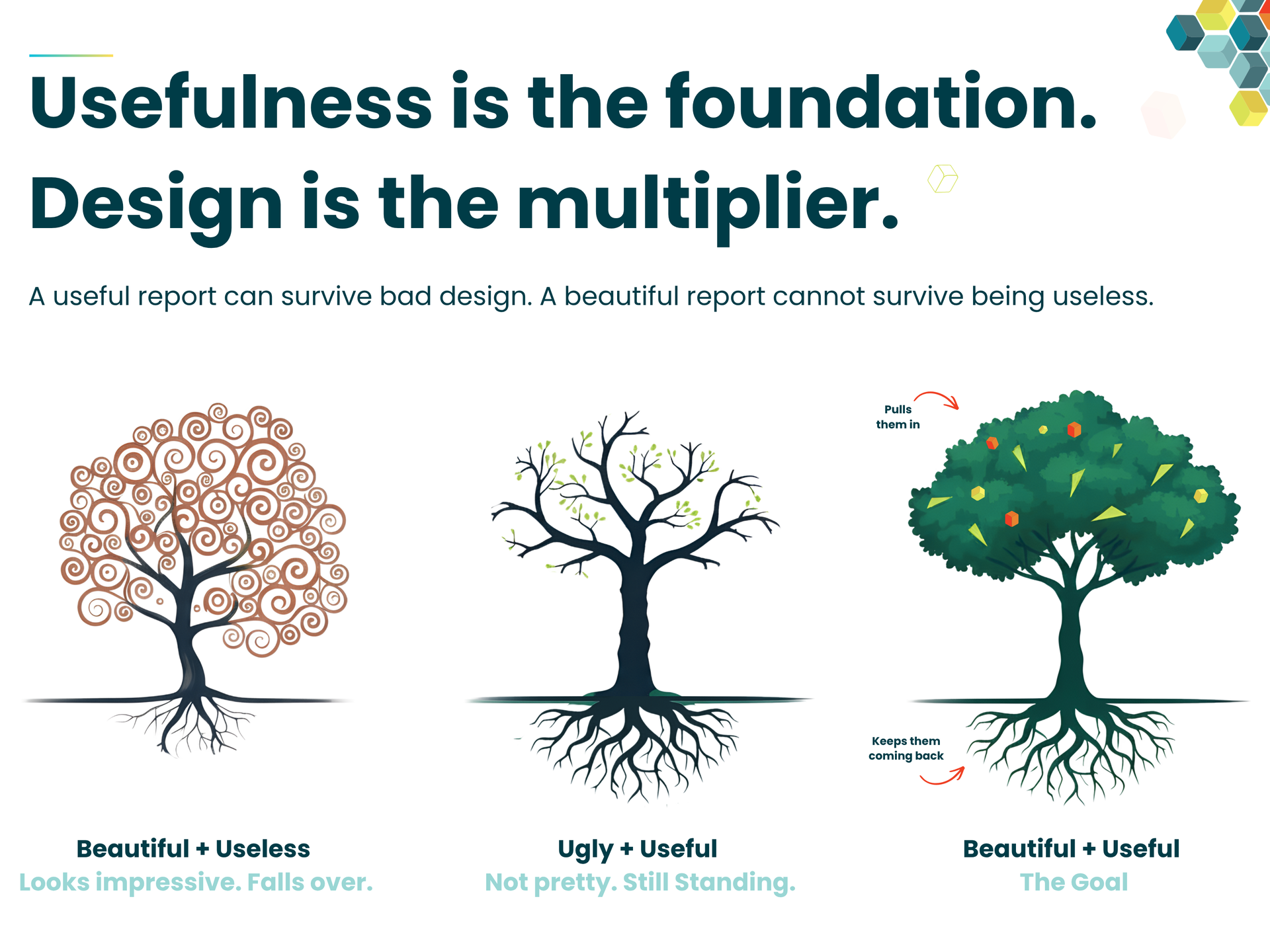
The Three Trees of Power BI Reporting
Tree 1: Beautiful + Useless
This is the report that gets the most attention on day one and the least attention by week three. The reveal goes brilliantly. Stakeholders smiling, your line-manager gives you the thumbs up, screenshots get shared. The developer walks away thinking this one will not end up in the dashboard graveyard, I've nailed the approach for all future solutions. The visuals are sleek, branding is on point, first impression has done its job.
Day one is the honeymoon and by day three people are still clicking in. By week one, the energy starts to drop and the first “hmm” appears. Someone asks a question the report cannot answer, someone else opens it, scrolls around and closes it without taking anything useful away. By week three, it has quietly disappeared into the dashboard graveyard.
That is tree 1. Above the ground, it looks impressive, but below the ground there is nothing holding it up. Strong canopy, weak roots. It catches the eye, but it does not last. The painful part is that the developer often will not even notice it has died. There is no dramatic failure or big meeting where everyone agrees the report is useless. It just stops being opened and the next time anyone mentions it is when someone asks, “do we still need this?”. This goes back to another discussion of build products, not tech outputs.
Beautiful + useless is the trap because it feels like success at first. The reaction is real and the buzz is real, but buzz is not adoption.
Tree 2: Ugly + Useful
Now this one is the unpopular truth and I am going to call it out clearly because over a decade of doing this work has taught me it is the reality, especially with senior stakeholders.
I have seen beautifully designed reports take weeks to build and get dismissed in seconds. I have also seen ugly reports, reports that broke every report design and data visualisation rule and reports I would never put in a portfolio, get used by directors, managers and operators because they simply answered the right questions.
When a senior stakeholder is under pressure, when their numbers are being asked for in a meeting, when their team’s and their own performance is on the line, they do not care how the report looks. Do not misunderstand me though, as you will see below, the goal is a report that is both useful and beautiful. But if that person, in that moment, had to choose between a beautiful report that does not help and an ugly report (still usable of course) that gives them the answer, which one do you think they would use?
That is tree 2. It has a scrappy canopy, it is rough around the edges and it is not winning any design awards, but the roots are deep and the foundation is solid. It answers a real question, supports a real decision and helps a real person do their job.
This is the bit that makes some people uncomfortable. An ugly report that answers the right business question will outlast a beautifully designed report that answers nothing. Not because ugly is good, because it is not, but because usefulness is what the user comes back for.
When someone’s job, reputation or quarterly performance is on the line, they will use whatever helps them succeed. They will not reach for the prettier option, they will reach for the one that works. That is the bit consultants and developers sometimes do not want to hear because it challenges the order we tend to work in. It is also why I keep saying, get the foundation right first. Tree 2 is not the goal, but it proves something important: the report has value. Once a report has value, design has something to amplify.
But let me be super clear about what is happening in that scenario. The director using the ugly report is not proof that data visualisation does not matter. They are paying a tax in extra reading time, extra mental effort and a higher risk of misreading the numbers. They just pay it willingly because the alternative gave them nothing at all. Good data visualisation is not decoration, it is cognitive engineering too. It reduces the effort it takes a brain to extract meaning from numbers. Tree 2 wins the moment, but it still costs the user something every time they open it.
Tree 3: Beautiful + Useful
This is the goal, and this is what we are aiming for. Tree 3 has strong roots and a strong canopy. The report answers the right question for the right audience, but it is also clear, well-structured, easy to read and a pleasure to use. It pulls people in on day one and keeps them coming back on day thirty.
This is also where the title of this blog finally clicks into place.
Usefulness is the foundation because without it, nothing you build above ground really matters. The roots have to be there first. Design is the multiplier because once the foundation is there, design takes the value the report already has and makes it more visible, more trusted and easier to act on. It does not create the value on its own, but it amplifies the value that already exists.
Multiply nothing by 10 and you still get nothing. That is tree 1. Multiply something real by 10 and you get a report people use, share, defend and refuse to give up. That is tree 3.
This is the bit organisations underestimate. They look at tree 3 and assume the magic was in the design, but it was not. The magic was in the order. The design worked because there was something underneath it worth designing for.
And when I say design, I do not just mean the first impression. I mean the whole experience of using the report: clear layout, sensible navigation, useful tooltips, clean filters, update well, theme, right size, explore elements, consistent naming, responsive pages, clear interactions and definitions people can actually understand.
That is the final refinement that makes a report feel professional and trusted. But again, it only works when the foundation is there first. A tidy report with no clear purpose is still a weak report. You are just polishing the wrong thing. The best Power BI reports I have ever helped deliver were not always the prettiest at first draft. They were the ones where the foundation work was done properly: the audience, the goal, the KPIs, the decisions and the actions. Once that was solid, the design lifted them and the final refinements made them last.
That is the standard. Not ugly reports. Not pretty reports. Useful reports, designed well and trusted enough to be used.
Final Thought
So let me be clear. I am not arguing for ugly reports.
I am arguing against beautifully designed reports with no business purpose.
The goal is not to choose between useful and beautiful. The goal is to build Power BI reports with strong roots and a strong canopy. Reports with a clear audience, a clear goal, meaningful KPIs, trusted definitions and design that helps people understand what is happening, why it matters and what to do next.
That is when Power BI stops being just another reporting output and starts becoming something people actually use. A useful report gives people a reason to come back. Good design makes that reason easier to see, trust and act on.
Usefulness is the foundation. Design is the multiplier.


.avif)

.png)