




You have probably seen the below meme doing the rounds - i've have seen it several times. So, it's dad lying in a sunny meadow, joyfully lifting baby into the air, captioned "Dashboard Designing". Then the same scene in a burning apocalypse, captioned "Data Preparation". It gets shared constantly in the data community and every version carries the same message... the dashboard is the easy bit, the real work is the engineering underneath. Meanwhile, the dashboard graveyard keeps filling up with reports nobody opens and most of them had perfectly good pipelines behind them.
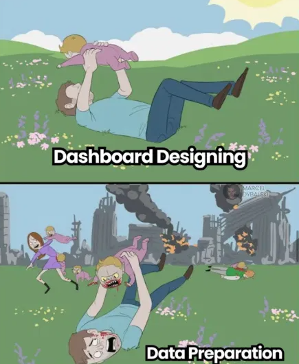
Here's the thing. I half agree with the meme. I've been saying for years that the report build is the easy part. But the meme swaps in the wrong hard part and I want to talk about the panel nobody draws.
What is the dashboard graveyard? The dashboard graveyard is where reports go when they stop being opened. They were requested, built, launched and then quietly abandoned, regardless of how well the data behind them was engineered. In my experience, most reports end up there for reasons decided before development ever started, because nobody established what was genuinely needed in the first place. In other words, the issue begins well before we launch Power BI Desktop or any other BI tool.
A few things I want you to take from this blog:
- Compared to the full reporting process, requirements gathering included, the build is usually the easy part. I have said that for years.
- Data preparation is genuinely difficult, but technical quality does not guarantee that the final report will be useful.
- A perfect pipeline feeding an unused report is the same waste, just more expensive.
- The genuinely hard part is understanding what is needed and communicating the right solution back.
- Sometimes the right outcome of that work is not building the report at all.
The Meme Is Half Right
Let me be clear, I am not here to diss the engineering side - obviously not! That is also a lot of what I personally do and Metis BI does. Data preparation is proper work... no doubt! Connecting messy systems, handling missing records, modelling, validating, tuning performance... I have lived all of it and on a project where the need is well understood, it is often the a hard part of the delivery. The meme is not wrong that a huge amount of effort sits below the canvas.
And fair play, the meme lands because it corrects a real misconception. Many people outside data and BI see the finished dashboard and assume that is the whole job, without seeing the work required underneath it.
But correcting one misconception with another is not progress. The meme implies that once you respect the engineering, you have found the real work. You have not. You have found the visible half of it.
The Strawman in the First Panel
The meme only works if "dashboard designing" means dragging visuals onto a canvas, picking a pretty colour palette and being done with it. That is not dashboard design, report development, what a DataViz expert does, that is decoration... and decoration is exactly what leads to endless reports being generated and never used, because they were built with little thought into what was actually needed. Then comes the rise of "dashboards are dead" as a way to communicate insights, bla bla bla. I have lost count of the amount of times I have had to defend what a good reporting specialist actually does when in conversation with engineers and other tech experts.
Real dashboard design includes the part before any tool is opened... finding the actual audience, getting them in a room, pushing back on requests, helping people to stay focused, pulling the room back on target, working out the goal, the defintions and so much more. Refereeing a room of five stakeholders who, it turns out, have three different definitions of revenue, have never once agreed what success looks like and come from different areas of the business. I run these sessions regularly and I promise you... that room is not the sunny meadow. Anyone who has facilitated one knows exactly which panel of the meme it belongs in.
So when the meme paints design as the peaceful field, it is really painting a version of design where the hard part was ALREADY REMOVED.
The Third Panel Nobody Draws
Now, here is where it gets uncomfortable for both camps.
Skip the requirements work and it does not just ruin the dashboard layer. It ruins the engineering layer too. All those heroic pipelines the meme celebrates, the cleaning, the modelling, the validation... they are now doing all of that for a report nobody will open. The zombie apocalypse does not start in data preparation. It starts before the project does and both layers inherit it. The engineers just suffer it more expensively.
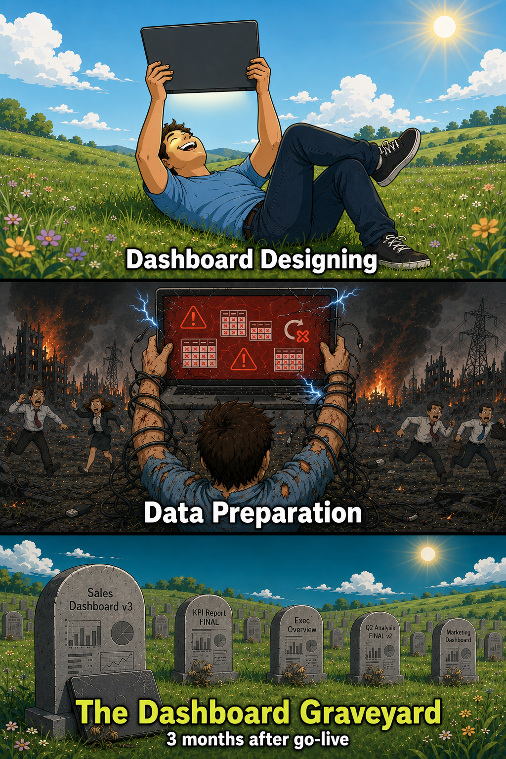
The graveyard does not check what your architecture looked like.
I learned this the hard way. Years back I was part of a loyalty solution where we ran straight into development off the back of a high-level ask. The delivery was solid, the data work was genuinely good. And once it shipped, the questions started coming in... Why isn't it being used? What was the point? Nobody could answer, because nobody had asked those questions at the start, nobody pushed for the right answers, when they were cheap.
The Actual Hard Part
So, if the build is easy and the engineering is hard-looking, what is genuinely hard? Two things, and they are both people work.
First, understanding. Sitting down with the actual end users, not just the person who requested the report and asking questions that go past "what do you want to see". Where are you trying to go? How do you know if you are moving towards it? What would you do differently if you knew? What is the defintion of X? Then challenging the ask when the answers do not hold up. I have written about this side of it plenty, in why many BI reports fail before they're even built and in the time I thought a client needed a dashboard and it turned out they needed clarity. I have been banging this drum for years.
Second, and this is the half people forget, communicating. This early work is not just extraction. Once you understand what is genuinely needed, you have to translate it into the right approach, get the architecture and the design right and bring the users along with the reasoning so they trust what lands. Taking a messy set of goals, challenges and half-formed asks and turning it into a solution people believe in... that is the skill. There is no feature for it.
To all the experts reading, yes, this is a simplification of a bigger process and I have broken the fuller version down in how to build reports that actually deliver results. The point here is where the difficulty actually lives.
Is It Worth the Time, Money and Effort?
This is the question the requirements gathering exists to answer and it should be answered before anything is built, not discovered after go-live. A reporting project costs real time, real money and real people. So before the first pipeline runs... is this worth it? What decision improves? What changes on a Monday morning because this exists?
Sometimes the honest answer is no. I have had people laugh when I say this, because surely that means less work for me. But if the process shows the report (or wider solution) is not needed, we have already delivered value. No report is better than a pointless one. We saved the budget, the engineering effort and everyone's time and usually the conversation resets around what is actually worth building.
This, by the way, is a difference between a consultancy and a build shop. A build shop takes the ask and builds it. A consultancy asks whether the ask is right first.
Why This Early Work Gets Skipped
If it matters this much, why does it get skipped so often? Because it does not look like work. There is no repo, no canvas, no screenshot for the stand-up. Building and diving into the tech and tools feels productive from day one. Understanding feels slow, not cool/sexy and it asks awkward questions that momentum would rather avoid. Also, many get the rush to simply launch tools Like Power BI Desktop and start creating.
But the output of this work, done well, is the most valuable artefact in the whole project... clarity, alignment, a measurable goal and a shared answer to why. Everything downstream, including the data preparation the meme celebrates, gets easier when that exists and harder when it does not. In fact, most of our clients always praise this side of the work at end of project.
This early conversation is where every Metis BI engagement starts. Before models, before pipelines, before a single visual, we sit with the people who will actually use the solution and work out what is genuinely needed, whether it is worth building and what the right approach looks like. From there, we have a proven approach to building reporting solutions that DO get used. It is the least glamorous thing we do and, in our experience, the most valuable. If your reports are being built but not used, that is usually the conversation that is missing, and it is exactly what a discovery call with us covers.
Summary
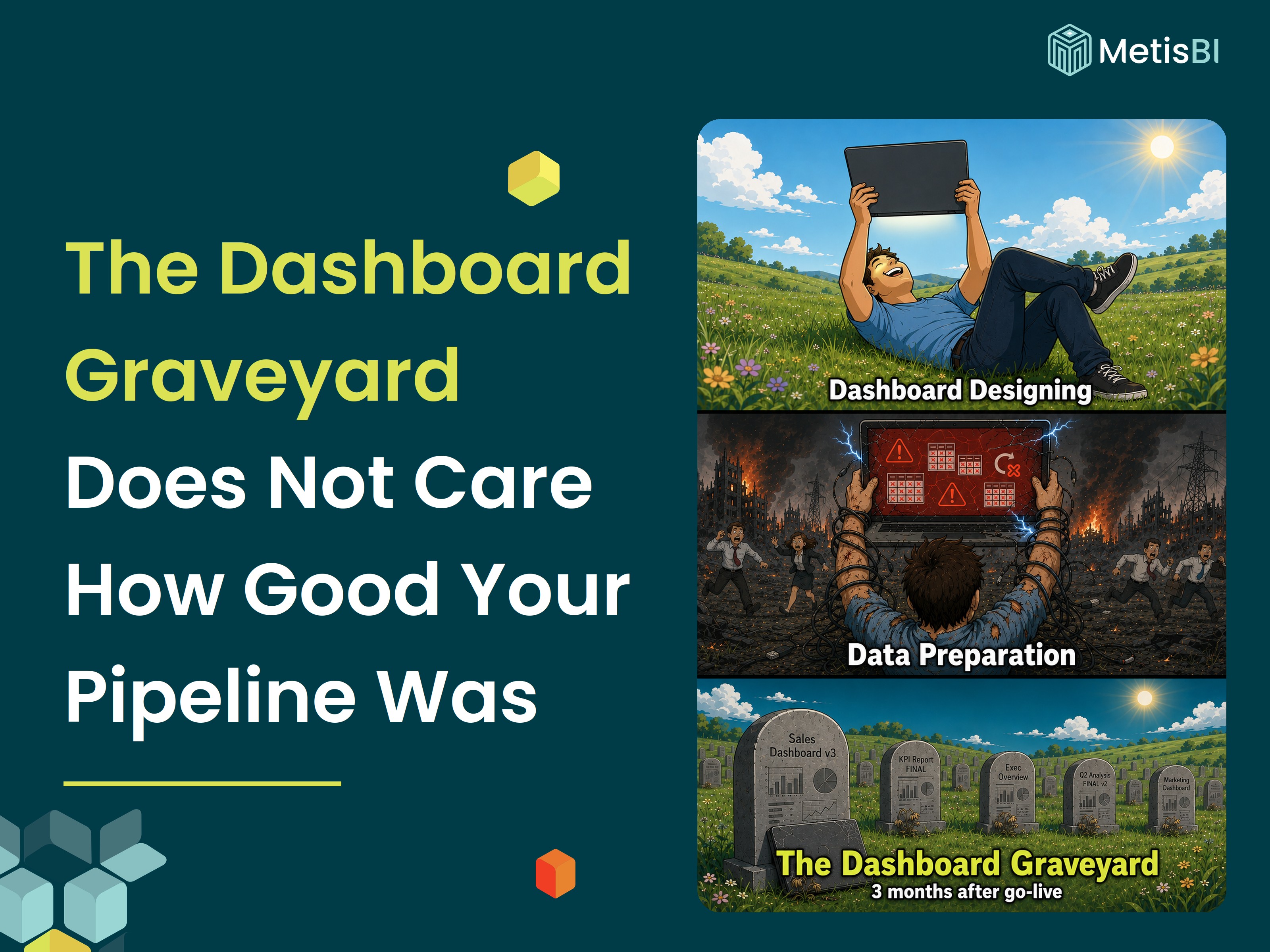
The meme is half right. The dashboard is not the hard part, and I have said that longer than the meme has existed (i think). But the engineering is not the hard part either, not in the way that decides success. Visuals are the easy part. Engineering is the hard-looking part. Understanding what is genuinely needed and communicating the right solution back, is the hard part that determines whether either of the other two was worth doing.
The graveyard is full of reports with beautiful pipelines behind them. Nobody asked what was actually needed. Ask first.


.webp)
.webp)
.png)