.png)


How to make your field parameter slicers work dynamically with comparative measures like Last Year, Budget or Target.
This is a conversation I have with clients all the time. In fact, it's come up so often that I thought its time to write a blog.
Here's the scenario... You've built a lovely field parameter in Power BI. Maybe it lets users toggle between Sales, ATV, UPT and Conversion %. Works brilliantly. But then someone asks "Can we also see last year's values alongside the current measure?" and suddenly, you're faced with a challenge that's trickier than it first appears.
The good news? There are several ways to solve this.
In this blog, I'll walk you through three practical approaches to using field parameters work dynamically with comparative measures. I'll show you some of the pros and cons of each, and by the end, you'll know which one makes sense for your situation.
Quick side note: I'm using "Last Year" (LY) as the comparative measure throughout this blog, but the same principles apply to Budget, Target, Prior Period or any other KPI benchmark you're comparing against.
What are Field Parameters?
Field Parameters is a feature in Power BI that enable users to dynamically change between different measures, such as Sales, ATV, UPT, Conversion % or dimension attributes (descriptive columns), such as Region, Product, Category, within a visual using a slicer. Prior to field parameters, we would manually create a detached table containing measure names, then write SWITCH based DAX measures that read the slicer selection and returned the corresponding measure. Field parameters made life easier by reducing the complexity and development effort.
The Core Challenge of Using Field Parameters
Before we dive into solutions, let's make sure we're all on the same page about what the problem we will be exploring actually is.
You've got a field parameter set up. Let's say it contains Sales, ATV, UPT and Conversion %. You've got a filter slicer that lets users pick which measure to display and you've got a visual showing that measure across different regions.

Now, you want to add the Last Year equivalent. Easy enough, right? Drag Sales LY onto the Y-axis alongside your field parameter.
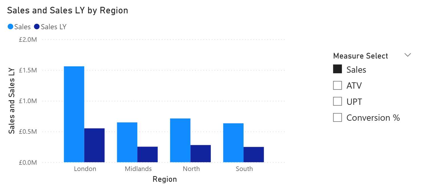
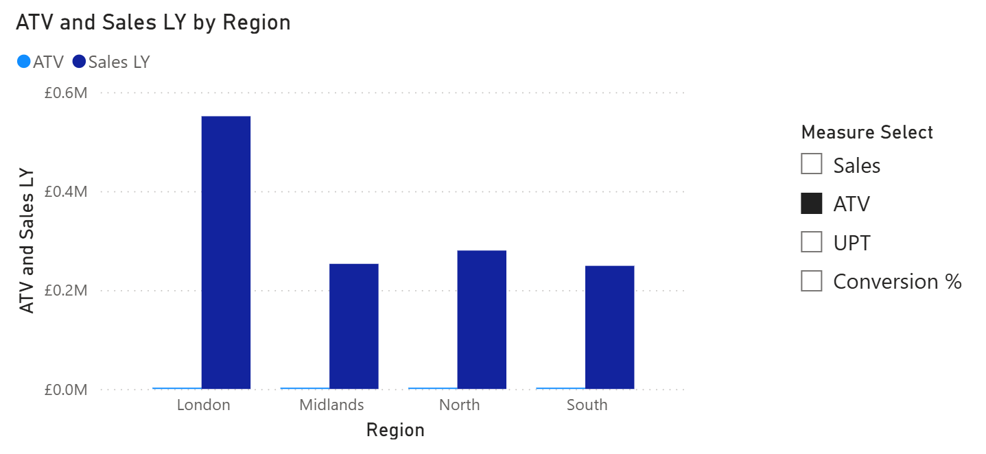
But here's the issue. When you switch the slicer to ATV, what happens? You get ATV from the field parameter… and Sales LY still sitting there. You're now comparing ATV to Sales LY. Which is, well, completely meaningless - not what we wanted!
What you actually need is a dynamic Last Year measure that changes based on which option is selected in your field parameter:
- If Sales selected in FP table, then show Sales LY
- If ATV selected in FP table, then show ATV LY
- If UPT selected in FP table, then show UPT LY
- If Conversion % selected in FP table, then show Conversion % LY
So, how do we solve this? Let me show you three approaches and you can decide which one makes the most sense for you.
Approach 1: SWITCH Measure with Dynamic Formatting
This approach uses a SWITCH statement combined with dynamic formatting to handle the LY comparison.
How It Works
You create a single measure that uses a SWITCH statement to detect which measure is selected from your field parameter, then returns the corresponding LY measure.
Selected Measure LY =
VAR _SelectedMeasure = SELECTEDVALUE('Measure Select'[Measure Select Order])
RETURN
SWITCH(
    _SelectedMeasure,
    0, [Sales LY],
    1, [ATV LY],
    2, [UPT LY],
    3, [Conversion % LY],
    BLANK()
)
The numbers in your SWITCH statement (0, 1, 2, 3) must match the Measure Select Order values in your field parameter table. If your field parameter has Sales at position 0, then "0, [Sales LY]" is correct. If you accidentally wrote "0, [ATV LY]", when users select Sales, they'd see ATV LY instead... completely wrong! Of course, you can use the column name too.
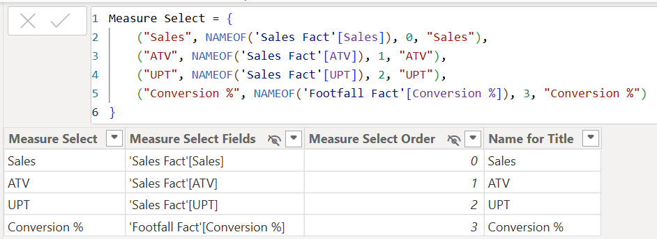
Always double-check the order in your field parameter table before writing your SWITCH statement, especially if you ever reorder the measures in the field parameter.
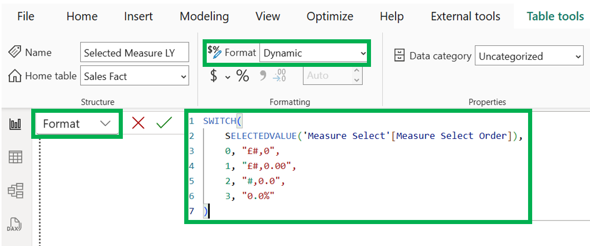
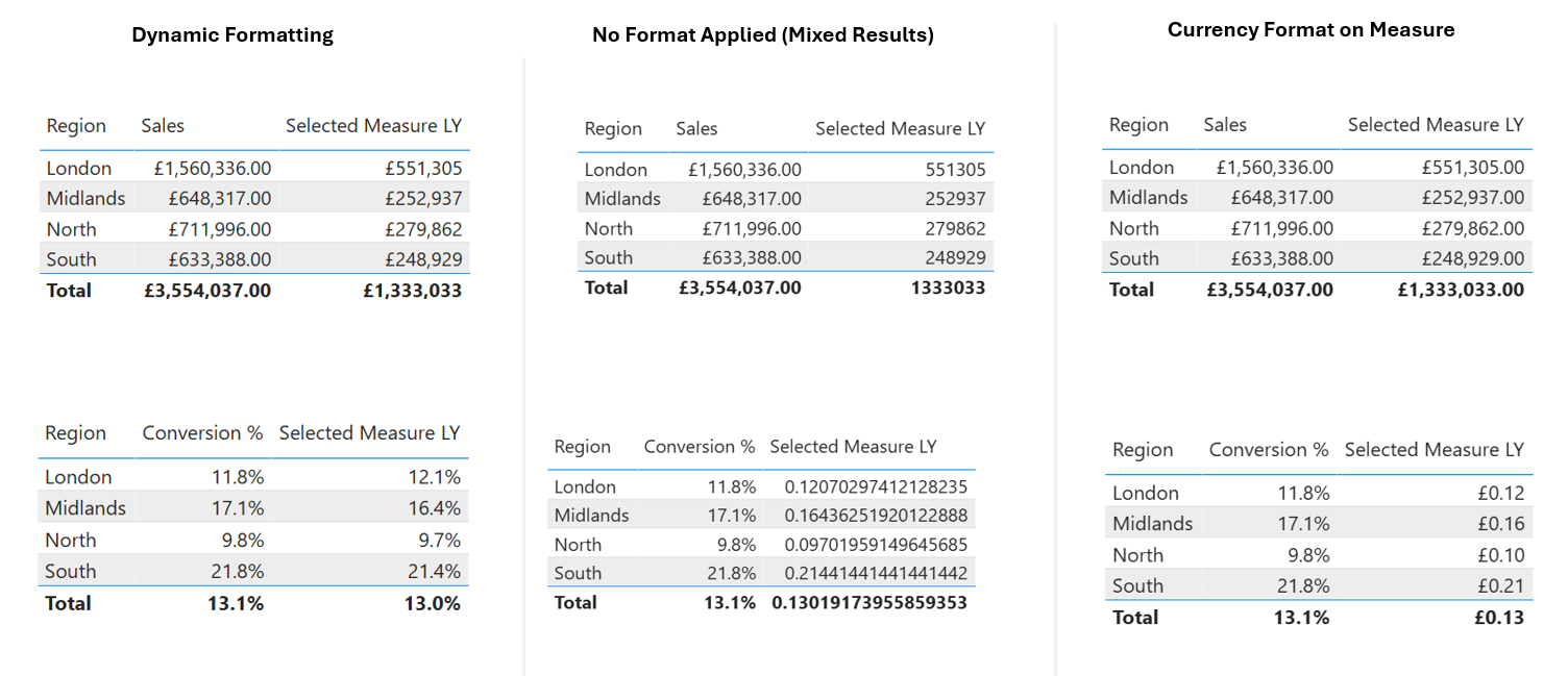
The Formatting Challenge (And How to Fix It)
Now, here's where it gets interesting and use to be a big pain. If you stop there, you've got a problem. Let's say you format this measure as Currency (£#,0). Great for Sales LY… but what happens when someone selects Conversion %? You'll see something like £0.25 instead of 25%. Not ideal.
The old solution was to use FORMAT() to convert to text - not great! I remember years back the headache this would cause. The right solution? Dynamic formatting. Here are the steps we should be following:
- Keep your measure numeric (don't use FORMAT).
- Select the measure in the Fields pane (In Power BI Desktop).
- Don't change the measure, just select the existing version.
- Go to the Format dropdown of the measure to see the query.
- Select Dynamic
- Enter the below format expression:
SWITCH( SELECTEDVALUE('Measure Select'[Measure Select Order]), 0, "£#,0", 1, "£#,0.00", 2, "#,0.0", 3, "0.0%")This keeps your measure numeric (so sorting and aggregations work properly) while applying the right format based on what's selected.
Implementation Steps
- Create the SWITCH measure above
- Add dynamic formatting using the expression above
- Remove any hard coded LY measures from your visuals
- Add the "
Selected Measure LY"to the Y-axis alongside your field parameter - Test by toggling through different measure selections
Below shows you how different formatting displays the "Selected Measure LY" measure.
Pros:
- Works everywhere: tables, charts, matrix (no visual type restrictions)
- Easy to troubleshoot: you can see exactly what the DAX is doing
- Dynamic formatting solves the currency vs percentage issue
- Clean table exports for users
Cons:
- Every new measure means need to edit the SWITCH in measure logic and format string
- Can get repetitive if you need LY, Budget and Target comparisons.
Approach 2: Calculation Groups
Let's look at the calculation groups approach and how it differs from approach 1.
How It Works
Rather than creating a specific LY measure that switches based on your field parameter, you can also create a new calculation group that applies a time intelligence transformation to whatever measure is active. Think of it like this, your field parameter handles what to measure (Sales, ATV, UPT) and your calculation group handles what period (Current, LY) - without the need of multiple switch statements.
Implementation Steps
- In Model view, go to Data panel
- Expand Semantic Model, then select "New calculation group" (Power BI Desktop)
- Name it something like "
Period Comparison" - Create two calculation items:
Current = SELECTEDMEASURE()
LY = CALCULATE(
    SELECTEDMEASURE(),
    SAMEPERIODLASTYEAR('Date Dimension'[Calendar Date])
)
Now that we have the above, in a visualisation do the below:
- Add the field parameter (e.g. Measure Select) in y-axis.
- The calculation group column should be in the legend.
- Keep your measure slicer to control which measure displays.
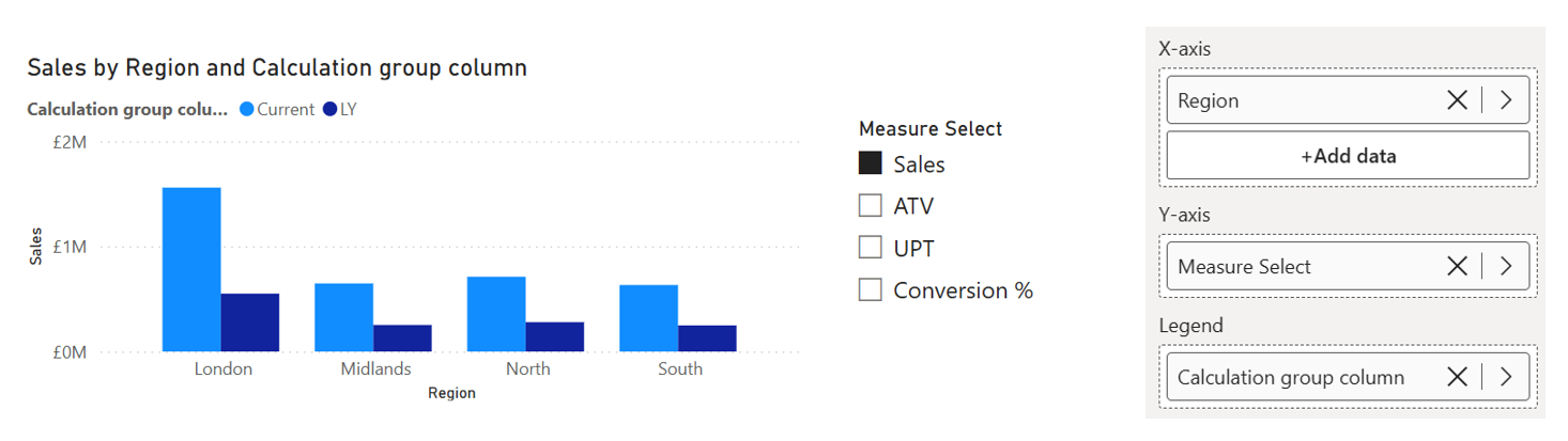
Now when you select Sales from your slicer, you automatically get Sales (Current) and Sales (LY). Switch to ATV? You get ATV (Current) and ATV (LY). No measure updates needed. This significantly improves the user experience for the end-user analytics.
Note: When you create a field parameter, the checkbox "Add slicer to this page" is auto-selected, hence it appears on page and you do not need to create a slicer.
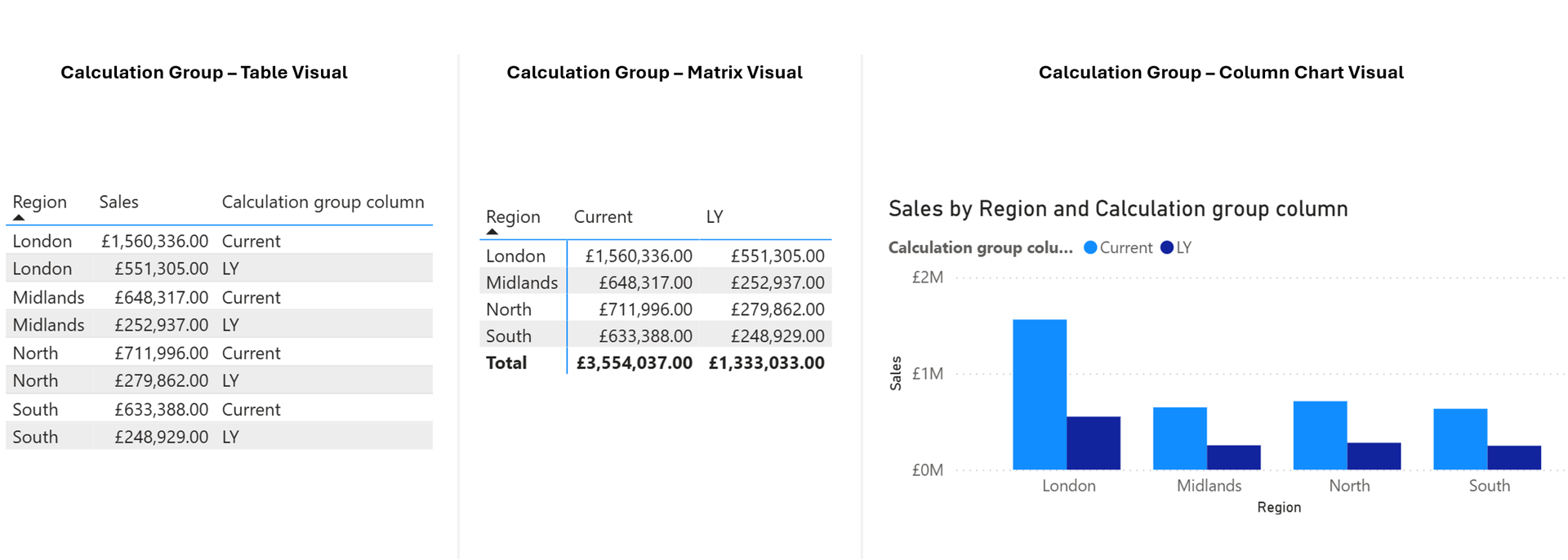
The Table Visual Challenge
Here's the gotcha with the calculation group... in a table visual, the calculation group items appear as rows, not columns. This is can be seen as a limitation of using field parameters with calculation groups.
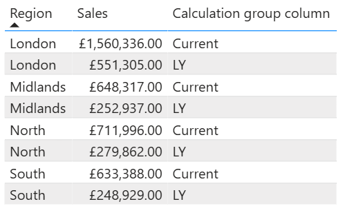
For other visual types, this works great. You can also use a Matrix visual instead of a table, putting the calculation group on columns. But that changes the visual type entirely, which might not be what you want.
Pros
- New measures automatically inherit all time periods without measure changes
- Clear separation: field parameters handle measure selection, calc groups handle time periods
- Extensible design: add YTD, QTD, or YoY% by creating new calc. group items
- Can create calculation groups in PBI Desktop now, no need for Tabular Editor
Cons
- Table visuals display time periods as rows rather than columns.
- Requires explicit measures; implicit measures are discouraged.
- Could mean complex debugging.
- Understanding calc. group precedence is important when using multiple groups.
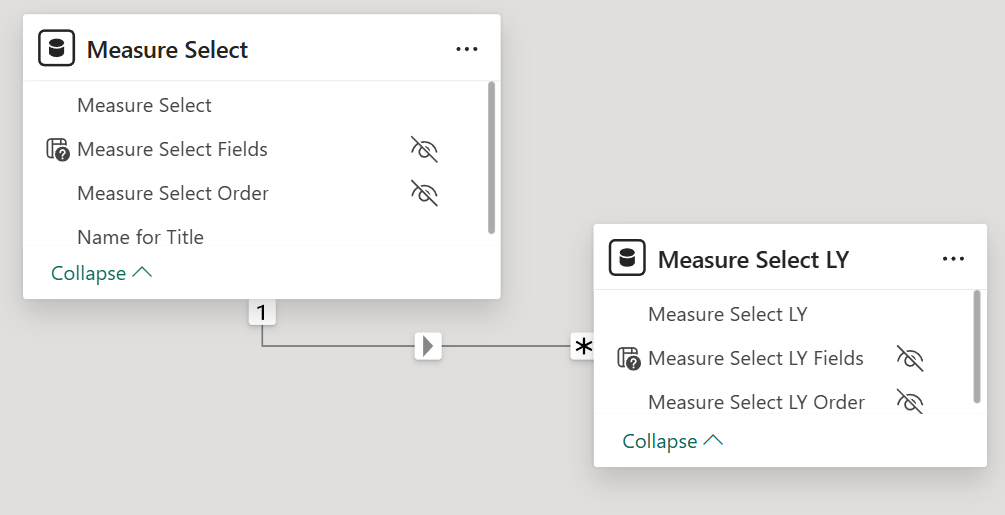
Approach 3: Second Field Parameter for LY Measures
Right, this is the approach that many overlook, but honestly, it's often the most practical.
How It Works
Instead of trying to make one measure dynamic, you create a new second field parameter that contains all your LY measures in the same order as your primary field parameter.
Think of your first field parameter as the core field parameter, this is where users make their slicer selection. That selection then propagates to the second new table field parameter (your LY measures) because they're connected through a relationship and matching order. When someone selects "Sales" from the slicer, both field parameters automatically align to show Sales and Sales LY.
So you'd have:
- Measure Select field parameter: Sales, ATV, UPT, Conversion %
- Measure Select LY field parameter: Sales LY, ATV LY, UPT LY, Conversion % LY
Both field parameters are controlled by the same slicer. Because they're in the same order and connected through proper relationships, when someone selects "Sales" from the slicer, both field parameters return the correct measures.
This same pattern would also work for other comparative measures too. You could create field parameters for LY Variance %, Budget or any other benchmark, just maintain the same order and relationship structure.
Implementation Steps
- Create your first field parameter as normal (this is your core field parameter)
- Create a second field parameter with all the LY equivalents
- Ensure both field parameters have the same order (Sales at position 0, ATV at position 1, etc.)
- Ensure both field parameter tables are connected through a relationship
Pros
- Each measure keeps its main format.
- Works easy in table visuals with proper column headers.
- Export-friendly for end users.
- Most can understand what's happening.
- No dynamic format strings or calculation group complexity.
Cons
- Additional maintenance, new measures require updates to both field parameters
- Slightly more complex data model
- Requires discipline to keep field parameters synchronised
Summary
Right, let's wrap this up.
Field parameters are brilliant for giving users control over what measures they see. They really helped in so many ways, including reducing the need to use Power BI Bookmarks to achieve the same level of interactivity. But when you want to show Last Year alongside whatever measure is selected, you need to think through your approach. We explored three solid options with the parameter feature which are summarised below:
1. SWITCH Measure and Dynamic Formatting: Simple, works everywhere and dynamic formatting solves the currency vs percentage problem.
2. Calculation Groups: Can be seen as a more enterprise approach... Scales well and saves you maintenance down the line. Just be aware of pros/cons highlighted above.
3. Second Field Parameter: Often overlooked, but genuinely practical. If you need clean table exports and have measures with different formats, this works really well.
Which is best? It depends on what you're building, your current data model structure, who will maintain it and who you're building for. But at least now you know what your options are and can make that call confidently.
Need Help Implementing This?
If you're working on a Power BI project and need a hand getting field parameters set up properly, or if you're running into issues with any of these approaches, we're here to help.
Whether it's a quick consultation to point you in the right direction or full support implementing the solution, we've done this enough times to know what works.
Book a free consultation here:
Power BI Help | Free Consultation & Support | Schedule a Call with Metis BI


.webp)
.png)
.png)