




Cards are often the most clickable things on a report page. They drill through, they cross-filter, they act as navigation. But nothing about a static card tells the user any of that. People find out by accident or they never find out at all.
The card visual now has a small option that helps with exactly this. The image element on a card supports 2 states, Default and Hover, so you can give the image a different look while the mouse is over the card. It shipped as generally available in the June 2026 update, and I have tested it, it does what it says and not much more. That is not a criticism. It is a genuinely useful little option, as long as you know what it is for.
Definition: Card visual hover states let you configure separate image settings for a card's Default and Hover states in Power BI. Using the States dropdown in the Image section of the format pane, you can change the image source, image fit, transparency, effects and background colour that apply only while a user points at the card.
Key takeaways:
- The Image section of the card visual has a States dropdown with Default and Hover (and the All).
- Hover settings apply only while the mouse is over the card, then it reverts to Default.
- You can change the image source, fit, transparency, effects, and background colour per state.
- It only benefits cards that use images, a plain number card gets nothing from it.
- Hover does not exist on touch devices, so it can carry visual polish, never essential information.
What it actually is
The card visual (the one that became generally available in late 2025, with callout images and multi-card layouts) lets you place an image alongside the value, an icon, a logo, a product photo. Until this update, that image was one fixed configuration. It looked the same whether the user was interacting with the card or not.
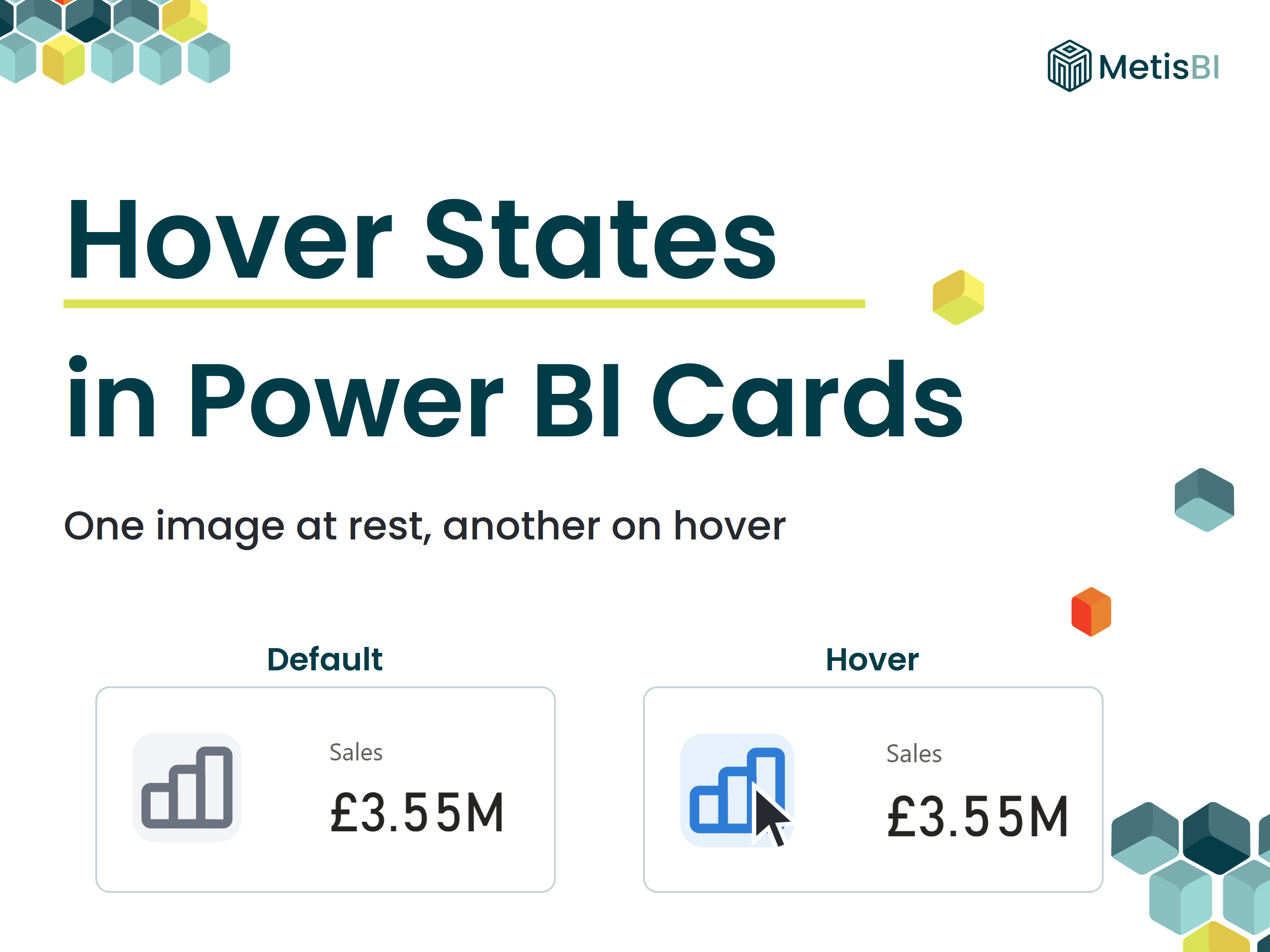
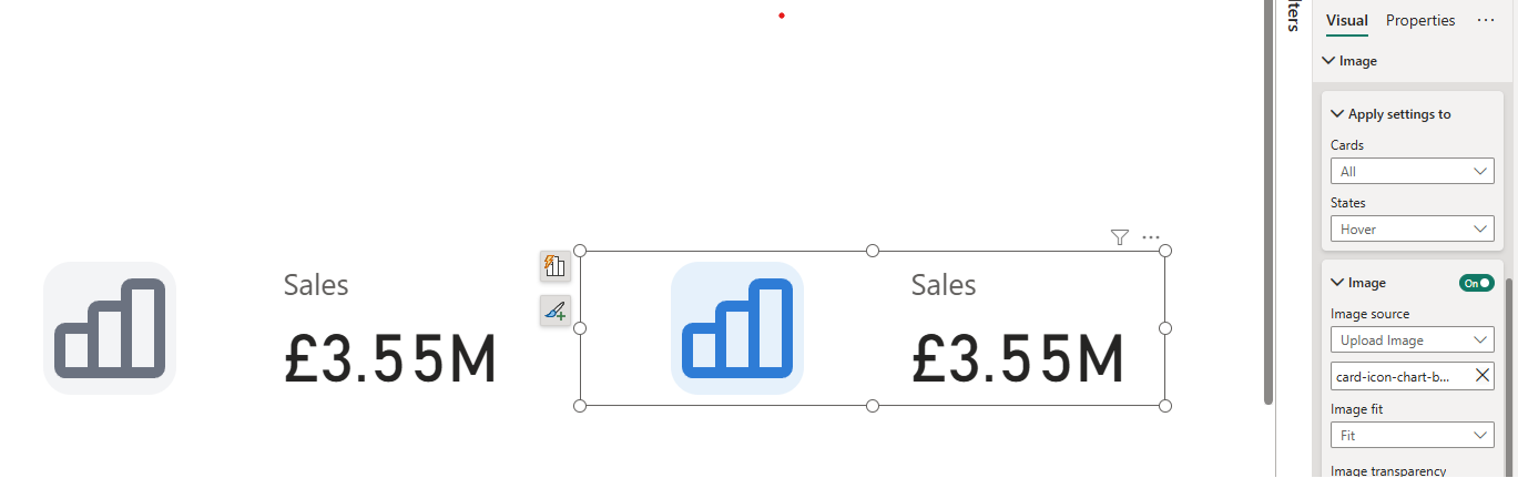
Now the image has 2 configurations. Default is the normal grey appearance on the left. Hover is what the image looks like while the pointer is over the card, which in my case is the blue. Move the mouse away and it snaps back.
In my test, I set the Default state to a muted grey icon and the Hover state to the same icon in colour with a soft background behind it in a blue theme. Point at the card and the icon lights up. Move away and it settles back to grey. Simple, and it immediately makes the card feel like something you can click.
How to set it up
With the card selected, open the format pane and expand the Image section. There is a States dropdown, it will be on Default. Configure your normal image there. Then switch States to Hover as I have above and change whatever should differ on mouse-over, a different image source, the fit, transparency, effects or the background colour behind the image.
One thing that caught me during testing, keep an eye on the Apply settings to dropdown in the same section. If your visual shows multiple cards, All applies the same image everywhere, while selecting a specific callout value lets you set images (and states) per card.
For the full option list, the link reference is the Microsoft Learn page on the card visual.
The quiet trend behind it
Here is the part I find more interesting than the feature itself. Small additions like this, hover states, tooltip sentence modes, per-state formatting, keep landing in native visuals month after month. Things that once required a custom visual, an SVG measure or an HTML workaround are steadily becoming a toggle in the format pane.
I made this argument at length in my guide to choosing between native visuals, custom visuals, SVG and HTML, go native first, because the native visuals keep absorbing the capabilities you used to leave them for. This update is another small data point for that argument. Not a big one. But the direction of travel is consistent.
Interactive touches like hover states only pay off when the interaction leads somewhere worth going, a drill-through that answers the next question, a navigation path that makes sense. That is report design work, not formatting work. It is also what our Power BI report development service is built around, reports designed from the decisions backwards, with the polish layered on top. It is a good fit for teams whose reports are functional but never quite feel finished.
Summary
Card visual hover states let you give a card's image a second look for while the mouse is over it, a different source, fit, transparency, effects or background colour, configured under the States dropdown in the Image section. It shipped as generally available in the June 2026 update. Use it to make clickable cards look clickable, keep it subtle, and never hang essential information on it, because touch users will not see it.
A small option. But native visuals are full of small options now, and that is rather the point.


.avif)

.avif)