.png)


A client asked me about SVGs not long ago. They had seen something online, one of those cool Power BI dashboards doing the rounds on LinkedIn, all custom progress gauges and glowing KPI cards, and they wanted to know if we could do something similar. Could we use SVG to make something more visual and aligned to what they wanted in their reports?
It is a good question, and I can imagine it will only get more common. So, I showed them something we had already built previously: our Top Performers Coverage solution. Each cell shows, for a given day and shift, what percentage of leads were handled by a top-performing salesperson, with the colour, the big number, the status label, and a small progress bar all drawn inside the cell.
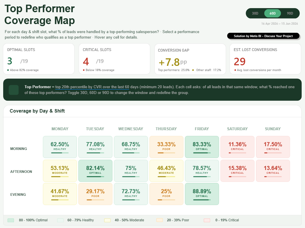
Those cells are SVG. There is no custom visual involved, nothing installed, nothing for an administrator to approve. Each one is a single DAX measure that writes a small piece of SVG code as text, and Power BI draws it as an image. Also, here is the detail I want you to hold on to... the grid itself is not even a table. It is built from three native Button Slicers, stacked and laid out to read like a heatmap, with visual level filters. The whole thing looks like it must be HTML. It is not! It is native visuals and SVG measures, top to bottom. Same data, better read and not a single third-party visual in sight.
That conversation is what prompted this blog, because the honest answer to "can we use SVG to make it more visual" is "yes, but it's not the first thing I would use". There is a sensible order to these decisions, and most of the examples you see online skip straight to the flashy end of it. Plus I will say it now, it of course depends on your specific scenario.
My position, stated plainly
I am a native visuals first person, and I will stay that way until there is a genuine reason not to be.
Here is why, with a real example. I started working with a new client who told me a visual from a previous engagement had simply stopped working. It had rendered fine for a few months, then one day it did not. When I looked, it was a third-party custom visual, not certified. Something in its lifecycle had changed, and the report broke through no fault of the data, the model or the people using it. At another organisation, a custom visual moved from free to paid and it also stopped working. What made it worse was that the team had no internal skills to work out what had happened or why, so a broken report sat there as a mystery until someone external could diagnose it. Which shows when selecting the option to go with, we need to think beyond the visual, who will be looking after this and much more, not only how does it look now.
You do not get that with native Power BI visuals. A native table, a native card, a native bar chart: these are maintained by Microsoft, they render everywhere the product renders, they export to PDF and PowerPoint, they survive tenant settings, they offer the interactive elements expected such as cross filtering and cross highlighting, and they do not quietly disappear because a third party changed their mind. That reliability is not a small thing when a board pack or a regulated report depends on it, or when a set of reports are the authority to decision making in the business.
So, the rule I work to, and the one I would suggest to any Head of Data, Power BI users, Power BI developers, is this: exhaust the native options first, and only step outside them when the native tools genuinely cannot do the job. Everything below is a ladder as each level buys you more design freedom and tends to charge you more in other places such as governance, performance and maintenance. The order is by how far each step takes you from native Power BI, not strictly by what I would choose, as you will see, I often (and for particular scenarios) reach for an SVG measure before a custom visual. The rule stays the same though, only go as far as you genuinely need to.
Step one: native visuals (and they are better than you think)
I am sure we can all agree, Power BI as is today is far from the version we had back in 2016. Incredible, a decade ago, and I am sure for all those using Power BI from 2016 would agree. What I mean is this, Microsoft really has spent the last few years closing the gaps that used to push people towards code, custom visuals and creative ways to display data differently.
First, a quick definition, because it matters for everything that follows. A native visual is one that comes built into Power BI out of the box, so things like the bar charts, the line charts, the table, the matrix, the card, the slicer and others you can see in the below screenshot. Simple! Microsoft builds them, Microsoft maintains them and they are there the moment you open the tool.
That said, let's now have a look at the direction of travel over the years. The Card visual, the KPI visual, the more recent changes to the Table and Matrix visuals, and the steady stream of updates to almost everything else, along with richer conditional formatting throughout. None of it makes much noise, but it adds up and the effects are real. A lot of custom visuals have quietly become redundant (in my opinion) or simply less needed. The ability to create a hierarchy within the native slicer is a good example. That used to be a custom visual, and now it is native feature in Power BI. Also, Date and range pickers on slicers are another more recent update. Things people once installed a third-party visual for (or built creatively) now ship out of the box, which means one less dependency to manage, license or worry about breaking.
Tables and matrices have come a long way too. You can size images by separate height and width, drive icons and data bars off your measures and apply conditional formatting by rule, by gradient or by a measure that returns a colour. Plenty of "I need a custom visual for this" requirements turn out to be a formatting panel away.
This is the part of the work I genuinely enjoy, getting creative with native visuals and using them in ways they were not strictly designed for. Plus, I always use to do this, I remember over 10 years ago I used to work with others tools such as BOARD MIT, OBIEE and Tibco Spotfire and use to do the same. Side note, from this experience (and when less experience in my earlier career years, I now understand the risks even more). For the Coverage Map at the top of this blog, this is also a good example. There is no heatmap visual in Power BI, so rather than installing a custom one, I stacked Button Slicers, used visual level filters and let SVG measures do the magic in the cells. It reads like a heatmap, it behaves like native visuals, and there is nothing third-party to break, license or approve. You can push this approach too far, and it has its limits, but it is always the cheapest and most durable place to start. If a native visual can do it, stop there. This is the most future-proof solution you can offer.
Step two: custom visuals from AppSource, and what "certified" really means
So what happens when native visuals genuinely cannot do the job? This is the point where most people reach for a custom visual, and it is worth slowing down here, because this is exactly the layer where the report I inherited had quietly broken.
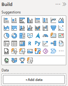
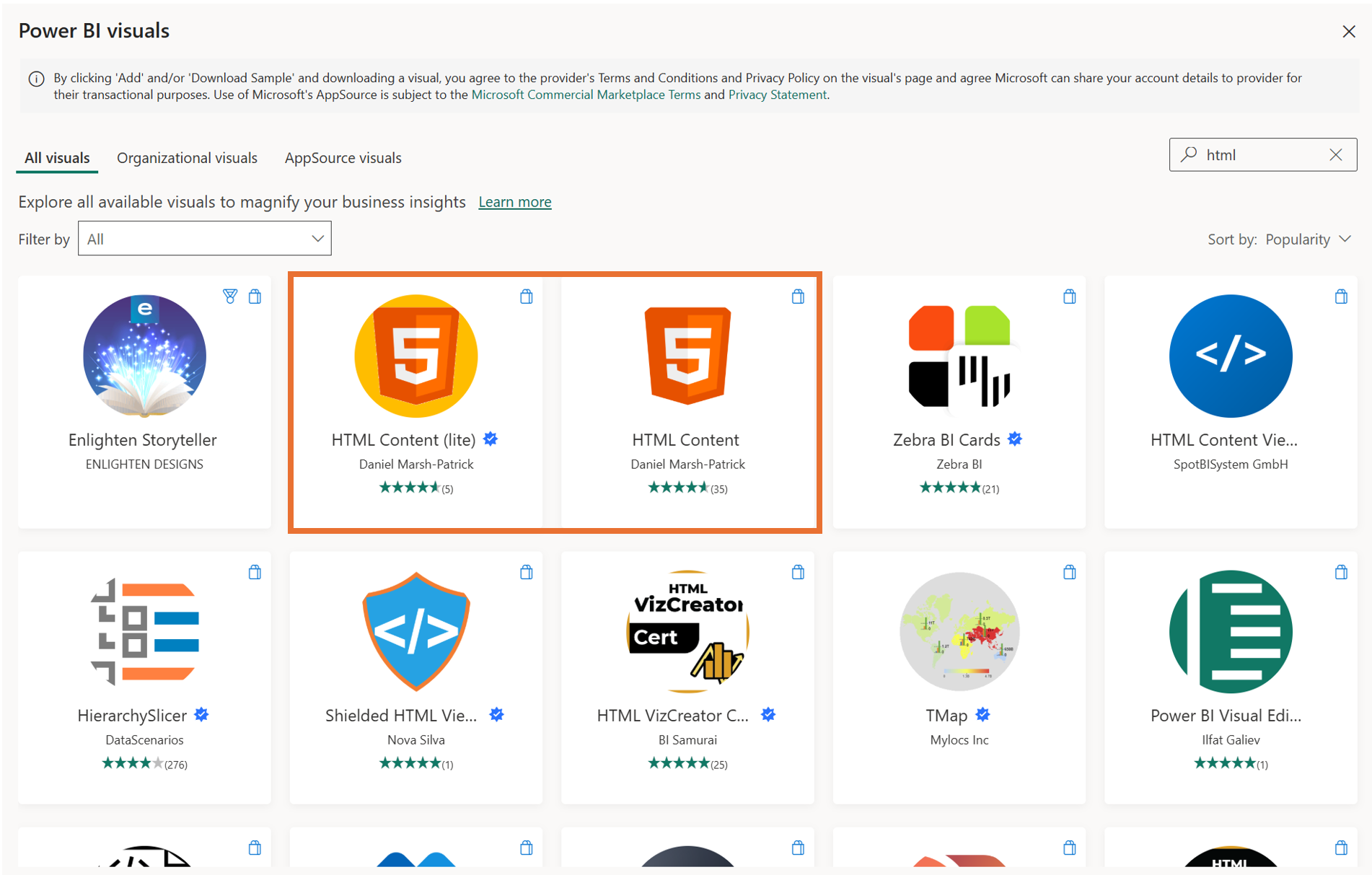
First, the definition, to sit alongside the one I gave for native. A custom visual is one that does not ship with Power BI. Someone outside the core product built it, and you bring it into your report yourself, either from Microsoft's AppSource marketplace or by importing a file. You have probably seen the marketplace, it is full of them, everything from fancy tables and gauges to KPI cards and specialist charts. I've added a screenshot of the AppSource when you select "Get more visuals" from Power BI Desktop.
The moment you import one, you have taken on a dependency. The visual is no longer Microsoft's responsibility to keep working, it is the third party's. That is the trade I am always weighing, because as I said earlier, that dependency is precisely what bit a client of mine when a visual changed and the report stopped rendering.
This is where certification comes in, and it is worth understanding what it actually means, because it is easy to misread. Certification is Microsoft's stamp that a visual has passed a set of code tests, the headline one being that the visual does not reach out to any external services or resources. No data leaves Power BI to some service on the internet. In Microsoft's own words, the tests are designed to check that the visual does not access external services or resources.
A few things follow from that, straight from Microsoft's documentation: A certified visual gets real, practical benefits. It can be exported to PowerPoint and PDF, and it shows up in the emails people receive when they subscribe to a report page. An uncertified visual does not get those, so if your report has to export cleanly or go out as a subscription, certification stops being a nicety and becomes a requirement.
Certification is optional, and it is the developer's choice whether to pursue it. So an uncertified visual does not automatically mean an unsafe one. A visual might be uncertified simply because it connects to an external mapping service or uses a commercial charting library, both of which are perfectly legitimate things to do, they just cannot be certified by definition. The point is that with an uncertified visual the burden of checking shifts to you, and in a privacy-sensitive or regulated environment that burden is real.
Microsoft is also clear that it is not the author of these third-party visuals, and advises you to contact the author directly to verify how they behave. Plus, it reserves the right to remove a visual from the certified list at its discretion. In other words, certified is a meaningful signal, but it is a signal, not a guarantee that nothing will ever change.
You can spot certification easily. In AppSource a certified visual carries a small badge, think like the famous blue tick we always had on Twitter.
To finish up, I actually try to stay away from custom visuals, and even when there is a visual that does what I need and native Power BI visuals don't offer it, if I can get creative and build it in another way, I would do that. I might even say I prefer, in many cases, using SVGs in DAX measures. But please, don't take that as the absolute rule you should use. It does always depend on various factors relating to your scenario. I have used custom visuals over the years, with great success, and without them would not have been able to hit the brief. One of those visuals was the Synoptic Panel, which I implemented, and it went live to one of the largest hospitality companies in the UK, accessed by 500+ people daily.
So my rule at this layer is simple. If a custom visual is genuinely needed, go for a certified one. You keep export and subscription support, and you know it has at least passed Microsoft's "nothing leaves Power BI" tests. If however you can do it with native visuals in Power BI, and the difference is small, just how it looks and you favouring the custom visual, if it is only for that and the difference is small, go the native side.
Step three: SVG measures, rendered inside native visuals
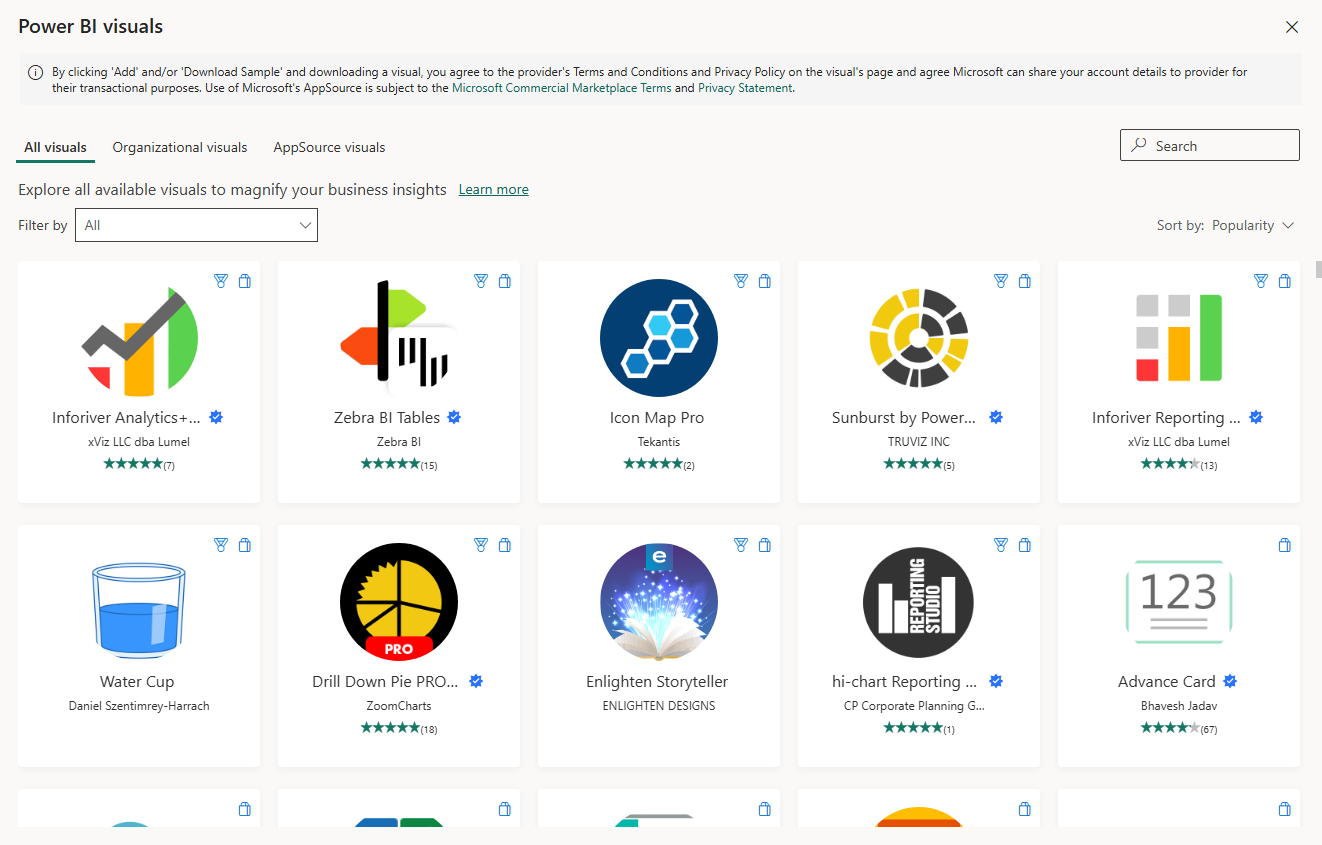
Now we are back to where my client asked me the question. This is the technique behind the Coverage Map I showed them. I share more details in the below screenshot. Notice, I am highlighting one of the rows which is a button slicer visual, the Button Slicer itself and the measure used under "Image" Format pane containing the SVG element.
First, what actually is SVG?! Well, it stands for Scalable Vector Graphics and the key word is vector. Unlike a normal image (think PNG) made of fixed pixels, an SVG is just text, instructions that describe shapes, a rectangle here, a line there, some text in this colour at this position. Because it is drawn from instructions rather than stored as pixels, it stays sharp at any size. And because it is just text, you can build it with text.
That is exactly what an SVG measure does. It is a DAX measure that returns a string of SVG code, prefixed so Power BI treats it as an image, with the measure's data category set to Image URL. Power BI then draws that code as a clean vector image inside a normal table, matrix, card, image visual, or as you see in above screenshot, a button slicer. The clever part is that the measure rebuilds the string every time the filter context changes, so the image redraws itself with the data.
In our Coverage Map, each cell is one of these measures. The same string sets the background colour, the border, the percentage, the status word and the width of the progress bar, all driven by the underlying coverage figure and the selected period. In simplified form, the heart of it looks like this:
RETURN
"data:image/svg+xml;utf8," &
"<svg xmlns='http://www.w3.org/2000/svg' width='640' height='420'>" &
    "<rect ... fill='" & CellBg & "' stroke='" & BorderColour & "'/>" &
    "<text ... fill='" & TextColour & "'>" & PctDisplay & "</text>" &
    "<text ...>" & UPPER( StatusText ) & "</text>" &
    "<rect ... width='" & BarFill & "' fill='" & TextColour & "'/>" &
"</svg>"
The full measure (further below in blog) does a little more work before it draws anything. It reads the coverage percentage and the status word for that shift and the selected period, then uses a set of SWITCH statements to turn the status into a colour palette, green for Optimal down to red for Critical. It works out the bar width by scaling the percentage to the card, and it handles the empty case, so a slot with no data draws a soft blank card instead of a broken one. Only then does it assemble the SVG string. Every visible part of the card, the colours, the number, the label, the bar, is just a variable spliced into the markup, and because the whole thing recalculates as the filters change, the card redraws itself with the data.
The reason I reach for this before any HTML approach is governance and maintenance. There is nothing to install, no administrator approval and it works in native Power BI visuals. Because it renders inside a visual, it exports cleanly to PDF and PowerPoint and shows up in subscription emails, none of which is guaranteed once you step into custom visuals. It stays sharp at any size, and there is nothing third-party to break, license or approve.
It is not free of trade-offs though, and I would not be doing my job if I skipped them. The output is rendered as a static image, so the SVG itself has no interactivity, no live animation, and no selectable text inside it. You can still make it feel interactive, and I have. On the Coverage Map, the cells lift as you hover, but that is done through the button slicer's interaction states, swapping in a different SVG on hover that redraws the border, not anything the SVG is doing on its own. And because it is a native button slicer underneath, I get a proper native tooltip on hover too, the detail card showing lead distribution, conversion rates and the gap. So the interactivity is real, it just comes from the native visual wrapped around the SVG, not from the SVG itself.
The DAX is string concatenation, which gets long and brittle as the design grows. A few small things trip people up too. You must set the data category to Image URL or Power BI just prints the raw code as text. Accessibility needs deliberate alt text, since a screen reader sees nothing useful in an image cell. Plus these measures should live in their own hidden measure table, not loose in the model or you end up with a cluttered mess six months later. Just as important, document them. That wall of SVG code looks intimidating the first time someone opens it, and a few lines of explanation save them a lot of worry.
For anyone who wants the full thing rather than the skeleton, here is the complete measure behind one of the cards. Note: this is a demo solution (not the real solution itself):
Morning Card SVG (Morning) =

VAR SelectedPeriod = SELECTEDVALUE( PeriodSlicer[Period], 30 )

VAR CovPct =
    CALCULATE(
        MAX( LeadAnalysis[CoveragePct] ),
        LeadAnalysis[Shift] = "Morning",
        LeadAnalysis[Period] = SelectedPeriod
    )

VAR StatusText =
    CALCULATE(
        MAX( LeadAnalysis[Status] ),
        LeadAnalysis[Shift] = "Morning",
        LeadAnalysis[Period] = SelectedPeriod
    )

VAR CellBg =
    SWITCH( StatusText,
        "Optimal",  "#D4EEE0",
        "Healthy",  "#EDF7F2",
        "Moderate", "#FEFCE8",
        "Poor",     "#FEF3E2",
        "Critical", "#FDECEA",
        "#F4F4F4"
    )

VAR TextColour =
    SWITCH( StatusText,
        "Optimal",  "#1B6B44",
        "Healthy",  "#2E7D5A",
        "Moderate", "#A08C10",
        "Poor",     "#C87A1A",
        "Critical", "#C0392B",
        "#888888"
    )

VAR BorderColour =
    SWITCH( StatusText,
        "Optimal",  "#7DC4A0",
        "Healthy",  "#A8D9BF",
        "Moderate", "#EDE88A",
        "Poor",     "#F5D9A8",
        "Critical", "#F5C6C0",
        "#DDDDDD"
    )

VAR PctDisplay =
    IF(
        CovPct = ROUND( CovPct, 0 ),
        FORMAT( CovPct, "0" ) & "%",
        FORMAT( CovPct, "0.00" ) & "%"
    )

VAR IsBlank = ISBLANK( CovPct ) || CovPct = 0

VAR BarFill = ROUND( MIN( CovPct, 100 ) / 100 * 320, 0 )

RETURN
IF(
    IsBlank,
    "data:image/svg+xml;utf8," &
    "<svg xmlns='http://www.w3.org/2000/svg' width='640' height='420'>" &
        "<rect x='0' y='0' width='640' height='420' rx='0' fill='none'/>" &
        "<rect x='10' y='10' width='620' height='400' rx='40' fill='%23F7F6F3' stroke='%23ECEAE4' stroke-width='2'/>" &
    "</svg>",

    "data:image/svg+xml;utf8," &
    "<svg xmlns='http://www.w3.org/2000/svg' width='640' height='420'>" &
        "<rect x='0' y='0' width='640' height='420' rx='0' fill='none'/>" &
        "<rect x='10' y='10' width='620' height='400' rx='40' fill='" & CellBg & "' stroke='" & BorderColour & "' stroke-width='3'/>" &
        "<text x='320' y='168' font-family='Arial,sans-serif' font-size='100' font-weight='600' fill='" & TextColour & "' text-anchor='middle' dominant-baseline='middle'>" & PctDisplay & "</text>" &
        "<text x='320' y='252' font-family='Arial,sans-serif' font-size='44' font-weight='700' fill='" & TextColour & "' text-anchor='middle' dominant-baseline='middle' letter-spacing='4'>" & UPPER( StatusText ) & "</text>" &
        "<rect x='160' y='310' width='320' height='16' rx='8' fill='" & BorderColour & "'/>" &
        "<rect x='160' y='310' width='" & BarFill & "' height='16' rx='8' fill='" & TextColour & "'/>" &
    "</svg>"
)
Used with care, SVG can take a visual to the next level, and the Coverage Map shows what you can do without a single custom visual. But I mean it when I say with care. This is not where you start. Build it natively first, get creative with the native visuals and only when they genuinely cannot do the job should you come here.
There is also a limit to how far SVG will take you. When you need real layout, text that wraps, a proper multi-column card, you are asking more of it than it was built for. That is usually the point where people look at HTML, which is the next step.
Step four: HTML, via the HTML Content visual
This is the top of the ladder, and I am careful using it. The HTML Content visual is a custom visual that you install from AppSource. I added below a screenshot of the two options that exist of the "HTML Content" visual:
You feed it a DAX measure that returns a string of HTML and CSS, and it renders that string as a live web fragment on your canvas. So the mechanism is the same idea as an SVG measure, a measure builds a string and the visual draws it, but here the string is HTML and CSS rather than SVG, and it renders as a proper web layout rather than a flattened image.
That difference is what gives it its power. With HTML and CSS you get full layout freedom, real text that wraps, multi-column cards, proper tables, the kind of styled components you see on a polished web page. If you have seen those eye-catching Power BI solutions doing the rounds on LinkedIn, this is often (not always - but often) what is behind them. These days some of them are built another way too, through Microsoft's Fabric Apps which is still in Preview and I will have focused blogs on this soon, but traditionally that web-app look came from exactly the HTML method we are talking about here.
Important: I consider myself someone who has always been able to create stand-out Power BI reports from native visuals, by getting creative with them, and I know there are plenty of others who work the same way. So, when I associate eye-catching solutions with the HTML technique, I am not saying that is how the best people are doing it or that eye-catching solutions can only be a result of using HTML. But I am seeing more and more people reach for methods like this, or Fabric Apps, to produce that look. Here's the thing to hold onto... whether a solution actually delivers insight and earns its return is not decided by whether you used native visuals, SVG or HTML to render it. That is part of the presentation layer. The value is decided elsewhere, as we will see further below.
To show you what it really involves I set out to rebuild the Coverage Map from the step above using the HTML Content visual instead, the same look, but produced as HTML rather than SVG in the native button slicer. So, to be clear, I only built the HTML version as an identical output to show you the difference. See below the two versions alongside each other.
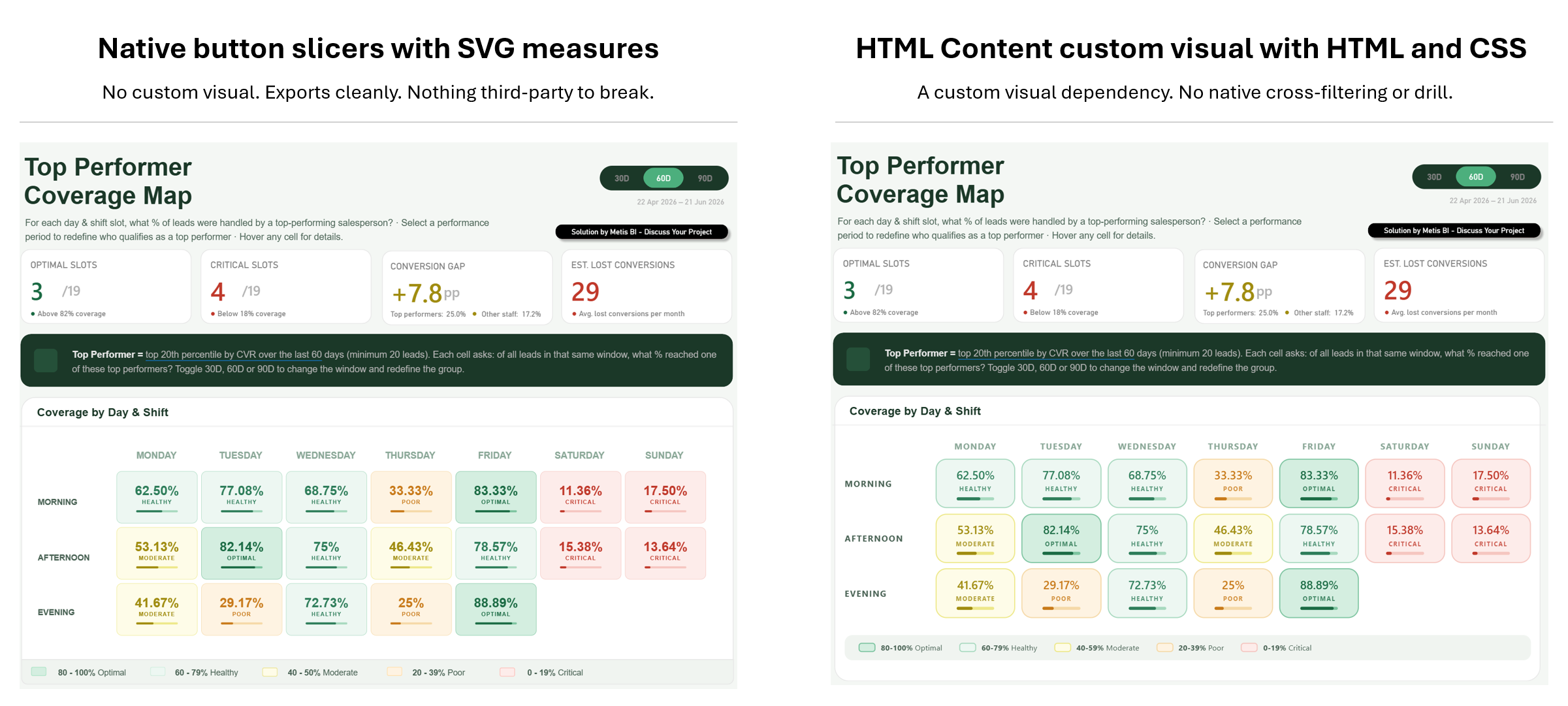
Look at the two side by side. They are, for all intents and purposes, identical. Same numbers, same colours, same layout, same little progress bars - the legend is a tad different, but one more prompt would have sorted that. One is built from native button slicers with SVG measures, the other from a single HTML measure in the HTML Content visual. This is exactly the point I want to make, as I could rebuild it in HTML as it works, but just because I can does not mean I should.
Here is the measure that produced the HTML version, the whole grid, every cell, the legend, all of it built and styled inside one DAX measure:
Coverage Grid HTML (Dynamic) =
VAR SelectedPeriod = SELECTEDVALUE ( PeriodSlicer[Period], 30 )
RETURN
"<div style='font-family:Segoe UI,Arial,sans-serif;padding:8px 8px 0 8px;'>" &

"<style>" &
".tile{transition:transform .15s ease, box-shadow .15s ease;}" &
".tile:hover{transform:translateY(-2px) scale(1.03);box-shadow:0 6px 18px rgba(27,56,40,0.18);}" &
"</style>" &

// ===== HEADER ROW =====
"<div style='display:grid;grid-template-columns:110px repeat(7,1fr);gap:8px;margin-bottom:8px;'>" &
  "<div></div>" &
  CONCATENATEX (
      SUMMARIZE ( ALL ( LeadAnalysis ), LeadAnalysis[Day], LeadAnalysis[Day Sort] ),
      "<div style='text-align:center;font-size:11px;font-weight:700;letter-spacing:1px;color:#8BA898;'>" & UPPER ( LeadAnalysis[Day] ) & "</div>",
      "",
      LeadAnalysis[Day Sort], ASC
  ) &
"</div>" &

// ===== SHIFT ROWS =====
CONCATENATEX (
    SUMMARIZE ( ALL ( LeadAnalysis ), LeadAnalysis[Shift], LeadAnalysis[Shift Sort] ),
    VAR ThisShift = LeadAnalysis[Shift]
    RETURN
    "<div style='display:grid;grid-template-columns:110px repeat(7,1fr);gap:8px;margin-bottom:7px;align-items:center;'>" &
      "<div style='font-size:11px;font-weight:700;letter-spacing:1px;color:#4A6355;'>" & UPPER ( ThisShift ) & "</div>" &
      CONCATENATEX (
          SUMMARIZE ( ALL ( LeadAnalysis ), LeadAnalysis[Day], LeadAnalysis[Day Sort] ),
          VAR ThisDay = LeadAnalysis[Day]
          VAR Pct =
              CALCULATE (
                  MAX ( LeadAnalysis[CoveragePct] ),
                  LeadAnalysis[Day] = ThisDay,
                  LeadAnalysis[Shift] = ThisShift,
                  LeadAnalysis[Period] = SelectedPeriod
              )
          VAR CellStatus =
              CALCULATE (
                  MAX ( LeadAnalysis[Status] ),
                  LeadAnalysis[Day] = ThisDay,
                  LeadAnalysis[Shift] = ThisShift,
                  LeadAnalysis[Period] = SelectedPeriod
              )
          VAR IsBlank = ISBLANK ( Pct )
          VAR Bg = SWITCH ( CellStatus, "Optimal", "#D4EEE0", "Healthy", "#EDF7F2", "Moderate", "#FEFCE8", "Poor", "#FEF3E2", "Critical", "#FDECEA", "#F4F4F4" )
          VAR Tx = SWITCH ( CellStatus, "Optimal", "#1B6B44", "Healthy", "#2E7D5A", "Moderate", "#A08C10", "Poor", "#C87A1A", "Critical", "#C0392B", "#888888" )
          VAR Bd = SWITCH ( CellStatus, "Optimal", "#7DC4A0", "Healthy", "#A8D9BF", "Moderate", "#EDE88A", "Poor", "#F5D9A8", "Critical", "#F5C6C0", "#DDDDDD" )
          VAR PctText = IF ( Pct = ROUND ( Pct, 0 ), FORMAT ( Pct, "0" ) & "%", FORMAT ( Pct, "0.00" ) & "%" )
          VAR BarW = ROUND ( MIN ( Pct, 100 ), 0 )
          RETURN
          IF (
              IsBlank,
              "<div></div>",
              "<div class='tile' style='background:" & Bg & ";border:1.5px solid " & Bd & ";border-radius:14px;padding:9px 8px;text-align:center;'>" &
                  "<div style='font-size:15px;font-weight:600;color:" & Tx & ";'>" & PctText & "</div>" &
                  "<div style='font-size:8px;font-weight:700;letter-spacing:1px;color:" & Tx & ";opacity:.8;'>" & UPPER ( CellStatus ) & "</div>" &
                  "<div style='height:4px;border-radius:3px;margin:5px 18px 0;background:" & Bd & ";'>" &
                      "<div style='height:4px;border-radius:3px;width:" & BarW & "%;background:" & Tx & ";'></div>" &
                  "</div>" &
              "</div>"
          ),
          "",
          LeadAnalysis[Day Sort], ASC
      ) &
    "</div>",
    "",
    LeadAnalysis[Shift Sort], ASC
) &

// ===== LEGEND =====
"<div style='margin-top:22px;background:#F0F4F0;border-radius:10px;padding:9px 18px;'>" &
  "<div style='display:flex;gap:22px;align-items:center;flex-wrap:wrap;'>" &
    "<div style='display:flex;align-items:center;gap:7px;font-size:10px;color:#4A6355;'><span style='width:22px;height:12px;border-radius:4px;background:#D4EEE0;border:1.5px solid #7DC4A0;'></span><span><b>80-100%</b> Optimal</span></div>" &
    "<div style='display:flex;align-items:center;gap:7px;font-size:10px;color:#4A6355;'><span style='width:22px;height:12px;border-radius:4px;background:#EDF7F2;border:1.5px solid #A8D9BF;'></span><span><b>60-79%</b> Healthy</span></div>" &
    "<div style='display:flex;align-items:center;gap:7px;font-size:10px;color:#4A6355;'><span style='width:22px;height:12px;border-radius:4px;background:#FEFCE8;border:1.5px solid #EDE88A;'></span><span><b>40-59%</b> Moderate</span></div>" &
    "<div style='display:flex;align-items:center;gap:7px;font-size:10px;color:#4A6355;'><span style='width:22px;height:12px;border-radius:4px;background:#FEF3E2;border:1.5px solid #F5D9A8;'></span><span><b>20-39%</b> Poor</span></div>" &
    "<div style='display:flex;align-items:center;gap:7px;font-size:10px;color:#4A6355;'><span style='width:22px;height:12px;border-radius:4px;background:#FDECEA;border:1.5px solid #F5C6C0;'></span><span><b>0-19%</b> Critical</span></div>" &
  "</div>" &
"</div>" &

"</div>"
So, now you have seen both. I replicated the same result two ways, the button slicer with SVG measures (the original that I actually used), and the HTML route (for the sake of this blog). Here is where I land with it... I would recommend the SVG measure with button slicers and visual level filters first, for every reason I set out earlier.
I will be honest about something though, because it cuts against the easy version of this argument. When you start from scratch, the SVG and native route is actually the harder one to build I think. You have to get creative with native visuals, stack things in ways they were not designed for, test what works and what breaks, all to land the look without inheriting the limitations. The HTML route, by contrast, is in some ways the easier path now, especially as most people just ask an LLM like ChatGPT or Claude to write it. LLMs are good at producing HTML, far better than they are at inventing creative ways to bend native visuals to the same end. Now here is the part I will own plainly... I am not a web developer, an expert in HTML or CSS. Can I make sense of it, sure! But that's also due to my interest in coding and personal projects I did over the years. Plus, I can promise you that most people producing these HTML solutions in Power BI are not experts either. The measure above did NOT come from deep front-end knowledge. It came from good prompting I did against an LLM and pasting the result into a measure.
I only hope the developers of these solutions also acknowledge that. That they call it out to clients honestly, and that they think beyond how it looks, that they put real care into performance, governance, security and maintenance before they ship it. Because that is where this gets serious and it is what the rest of this section is about. Don't agree on anything I said here, please do reach out.
Now, here are some of the limitations that matter, the ones the demos and online videos rarely show you and I think are worth calling out.
Let's begin with the interactivity part, as I think its a big one. Clicking a cell in the HTML grid doesn't do much. No cross-filtering, no cross-highlighting, no drill through, no show as table. I tested it myself, you can hover and the tile lifts, but that is a cosmetic CSS effect I built into it, not real interaction. The HTML sits outside Power BI's interaction model entirely. Compare that to a native visual, where every one of those behaviours comes for free. With HTML, the visual looks alive and behaves like a picture. Side note, while writing this, I did come across some content claiming some of this interactivity can be recreated, but I have not gone down that road myself. Why you maybe ask? Well, I ask myself for all the design flexibility HTML gives me, how much am I giving up to get it? Keep asking yourself that too.
The second point I would like to raise is the readability. Scroll back up and look at that measure. That is not something your average Power BI user can read or understand, and it is far away from the SVG example. Sure, the SVG measure was focused only on a single cell, the card itself. This HTML measure builds the entire heatmap structure, every row, every column, the header, the legend, all in one place. The complexity is different and most people opening it would not know where to begin.
Thirdly, we have the overall maintenance of the solution. Here, I would really ask put yourself in the shoes of the users who will need to look after this moving forward. Maintaining this is a genuine challenge for most users and as I have admitted, it was produced by an LLM in the first place. So think carefully about what that means... you would be putting something into production that you cannot fully explain. As a developer, I believe you must be able to walk someone through what you have built, the code, the logic, the decisions. In most cases like this, that ability is not really there, it was good prompting and a copy-paste. That is a problem the day someone else has to change it or the day it breaks.
Fourth, the custom visual dependency. The HTML Content visual is a third-party custom visual, and everything I said earlier about custom visuals applies here too. It can change, it can break, it carries the lifecycle, licensing and trust considerations of anything you bring in from outside the box. The SVG version has none of that, it runs on native visuals alone.
A few more worth calling out. On performance, this grid is small, but HTML re-renders the whole string on every interaction and refresh and on a larger model that cost can grow. On export and accessibility, a HTML measure does not behave the same way native visuals do when exported, so think about your subscriptions, your PDF and PowerPoint exports and your accessibility obligations before you commit. Plus on consistency, native visuals inherit your theme and adapt automatically when the business changes a colour or a definition. HTML does not, someone has to go back into the markup by hand.
Before finishing on the HTML option... I am NOT saying this makes HTML useless. It just means HTML should be a deliberate choice, for the rare case where you genuinely need a layout/visual nothing else can produce, where the team can maintain it and where it does not need to be clicked, filtered or drilled.
Before any of this: why are you building it at all?
Up to this point, we have spoken a lot about how to build something: native visuals, custom visuals, SVG measures and HTML Content visuals. I know that was the purpose of the blog, but as we move beyond native visuals, I think there is a real risk that developers get lost in the development detail. The precision of how a visual looks, the cleverness of the technique, the layout, the code behind it all, and in doing so, lose sight of what really matters.
That is all useful and as I said earlier, I enjoy that side of the work. I always have! I like seeing how far native visuals can be pushed and I like finding ways to make a report feel better without immediately reaching for a custom visual. But I also want to bring this back to the bit that matters most.
Before you decide whether something should be native, SVG, HTML or anything else, you need to ask whether the thing is worth building in the first place. This is where I think a lot of Power BI projects go wrong. Not because someone picked the wrong chart type. Not because the colours were not perfect. Not because the KPI card could have looked better. They go wrong much earlier than that, usually before Power BI has even been opened.
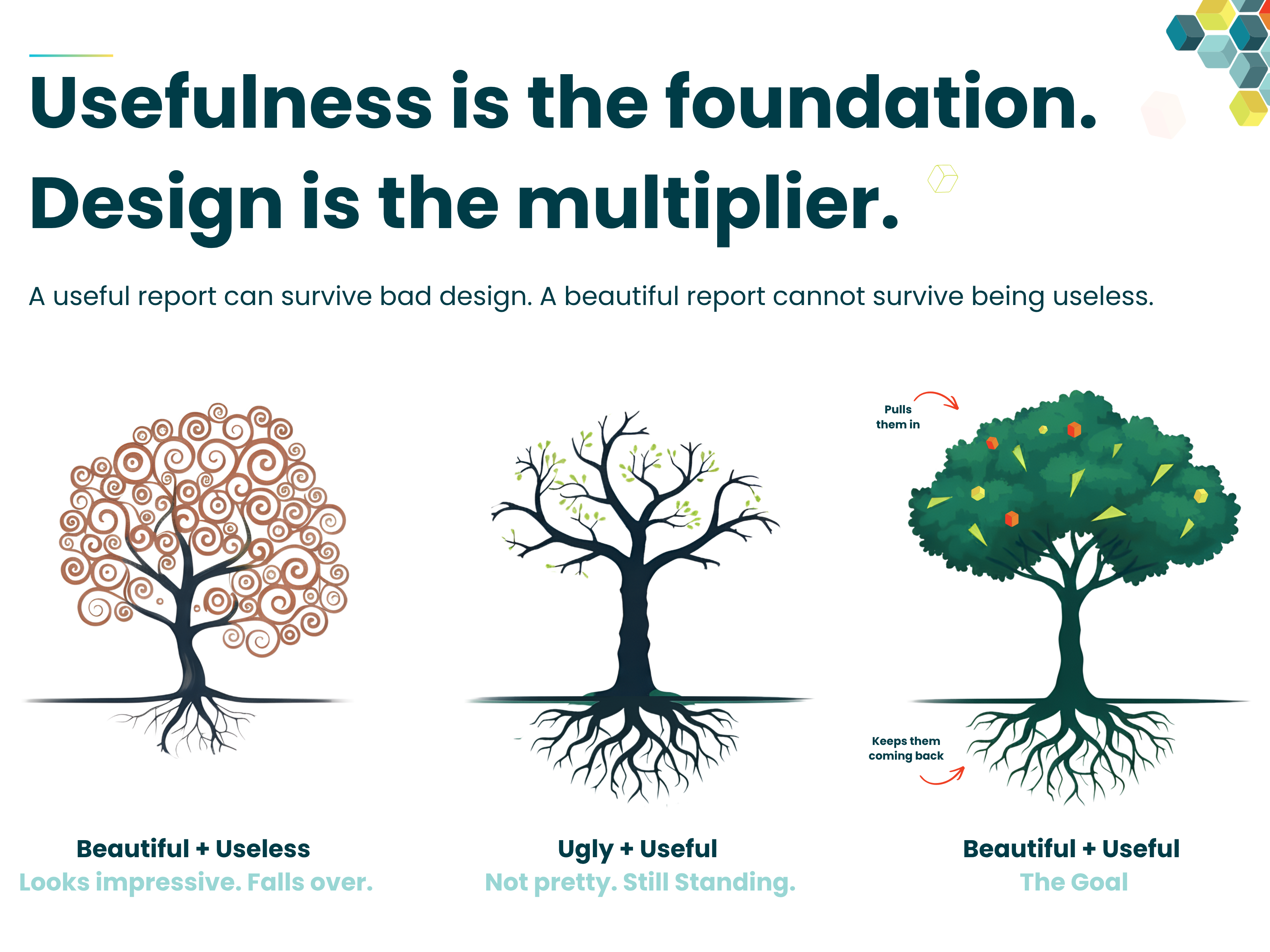
The real work starts with understanding the purpose of the report. Who is it for? What problem is it trying to solve? What decision should it help someone make? What action should someone take after looking at it? If those questions are vague, the development will be vague too. You might still end up with something that looks good, but that does not mean it will be used, trusted or acted on. I have written about this in more detail here: Useful Power BI Reports: Usefulness Is the Foundation, Design Is the Multiplier. The point is simple... design can multiply the value of a report, but only if there is value there to begin with.
That is the part I keep coming back to in a lot of my other blogs as well. Whether I am talking about why BI reports fail before they are built, why end users do not always know what they want, why wireframing matters, or how to build actionable dashboards, the point is usually the same. Successful Power BI development does not start with dragging visuals onto a canvas. It starts with getting clarity from the business.
And I know that sounds obvious, but it gets skipped all the time. Someone asks for a dashboard. Someone sends over a spreadsheet. Someone lists a few KPIs. The developer opens Power BI and starts building. Then a few weeks later, people realise the KPI definitions were not agreed, the audience was not clear, half the data is not trusted, or the report answers a question nobody is actually asking.
At that point, the visual choice is not the problem. SVG, HTML, a beautiful custom visual will not save it. Side note, if you want to know how Metis BI can help check our approach to Power BI Report Design and Development. All this is not admin or slowing the project down its the actual work.
Take the Coverage Map example from this blog. The reason it worked was not simply because it used SVG, that was just the technique. The real value came from the business question behind it: how many leads are being handled by top performers, by day and by shift? That is a proper business question, with a clear audience, a clear purpose and the potential to drive real action, such as rebalancing coverage, improving conversion and supporting better revenue outcomes. That is the difference!!
If the reason for building something is "it would look impressive", I would pause. Not because reports should not look good. They absolutely should and good design matters. But good design should support the decision, not distract from the fact there is no decision.
To finish up on this, I want to make one more point... this matters even more now because building impressive-looking things is getting "easier". You can ask ChatGPT or Claude to generate HTML, create SVG measures or to simply just build the entire solution. But looking advanced does not mean it is useful. The judgement is still the hard part. Knowing what to build, why it matters, how the KPI should be defined, whether the data supports it and how the business will use it is where the real value sits.
So, which do you choose?
Once again, and I mean this genuinely, it depends on your scenario. The data you are working with, how large and vast it is, the people who will need to maintain it, any security concerns, the industry you operate in, and plenty more. There is no single right answer that holds for every report, so treat the below as the order I lean towards, not a rule to follow blindly.
Start with native visuals, always. Push them as far as they will go. They are reliable, they export everywhere, they keep their interactivity, and Microsoft maintains them, not a third party. When native genuinely cannot do the job, I would then look at either an SVG measure or a custom visual, with a certified one preferred, and which of those I reach for depends entirely on the scenario I just described. An SVG measure is brilliant for in-cell work like progress bars, sparklines, status indicators and composed cards like the Coverage Map, with nothing to install and clean exports, as long as you isolate, hide and document the measures. A certified custom visual, on the other hand, is fully supported and easy for a team to pick up, which sometimes matters more than anything else. An uncertified visual should come in as a reviewed exception. Also right at the top sits HTML through the HTML Content visual, the certified lite edition by default and only when you genuinely need a layout nothing below can deliver, and only when the team can actually maintain it.
Plus there are signals that should send you back down a step, wherever you are. If you need the visual to cross-filter or drill through, HTML will not help you. If your data is large, watch performance. If the next person cannot safely change what you have built, do not ship it. If the report has to export or go out as a subscription, avoid the uncertified edition. If accessibility matters, budget for alt text or think again.
None of this is a vote against SVG or HTML. SVG earned its place in the Coverage Map and HTML earns its place too, just only when the scenario genuinely calls for it. It is a vote for choosing them on purpose, from the bottom up, rather than starting at the top because it looked impressive online.
Usefulness is the foundation. Design is the multiplier. In that order, every time. If you want a second pair of eyes on where your reports sit or you have inherited a report held together with custom visuals you are not sure about, that is exactly the kind of governance review we do at Metis BI.


.png)
.png)