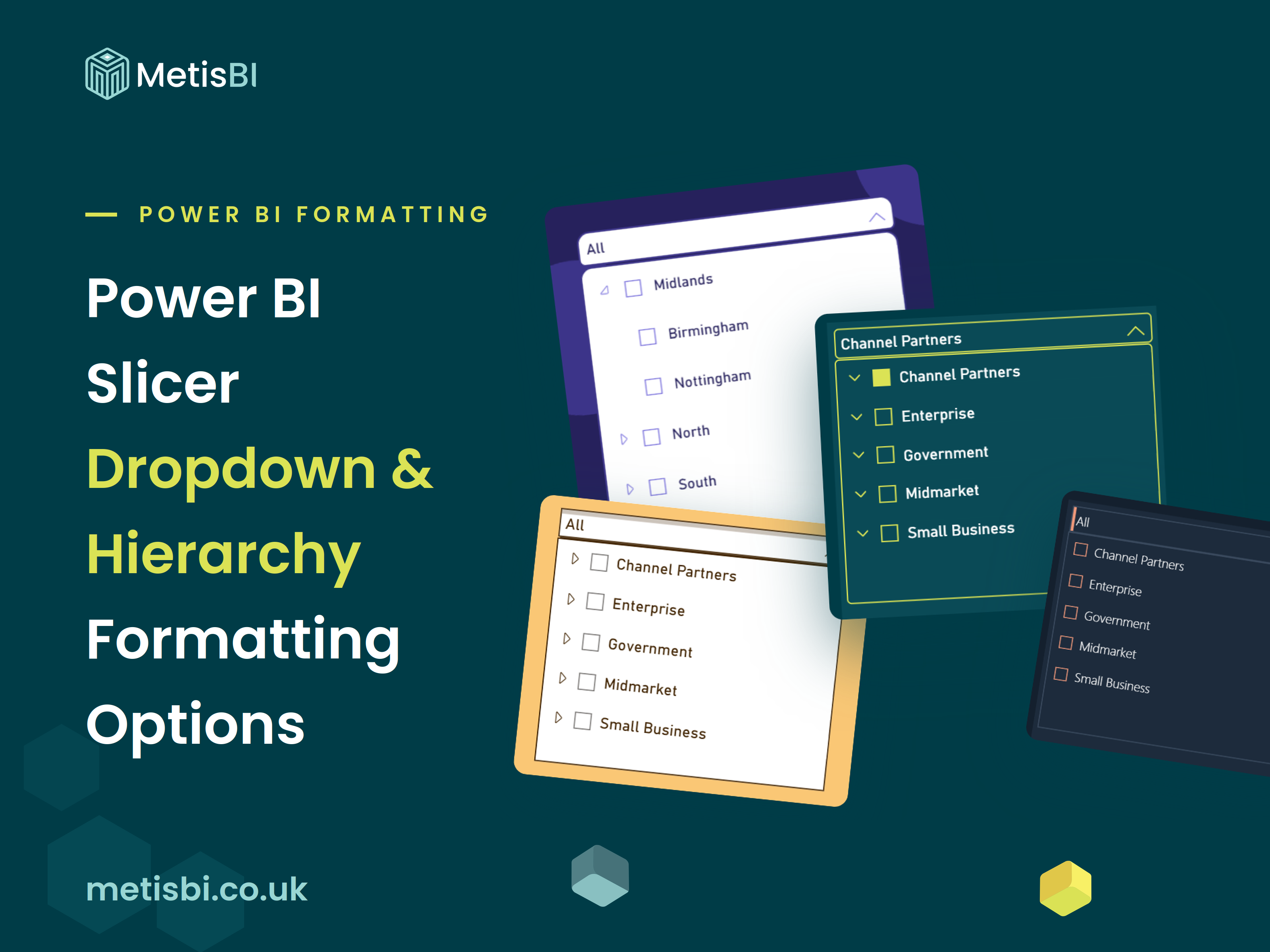


The dropdown slicer's border, its open icon and the expand and collapse icons on hierarchy slicers can all finally be coloured from the formatting pane, generally available, no preview toggle. The change shipped in the August 2026 update and it closes one of the oldest formatting gaps in the product.
If that sounds minor, it is, and that is rather the point. For years the honest answer to "how do I change that grey dropdown border" was that you could not and people worked around it with shapes and background blocks - including me. This release removes the workaround. It also continues a bit of a run for the slicer visual... selection icon colours arrived in June 2026, the Date picker style for date slicers is in preview, and now this. I will cover the Date picker in its own blog.
Here is what changed and what it makes possible.
What's new
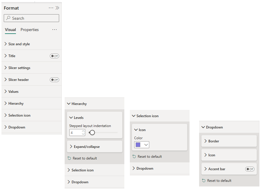
One genuinely new top-level section, Dropdown, appears in the Visual formatting pane when the slicer style is set to Dropdown. It covers the dropdown box, closed state and open panel alike, through three cards: Border (colour and rounded corners), Icon (the open icon's colour and transparency) and Accent bar (a colour bar on any edge of the box, with position, colour, transparency and width). Flip Individual corners on inside the Border card and the single Rounded corners value greys out in favour of four per-corner fields, one radius each.
The Hierarchy section is not new itself, it has long held the stepped layout indentation under Levels, and it applies once a slicer has more than one field. What is new sits in its Expand/collapse card, a colour for the expand and collapse icons, alongside the existing choice of icon shape, chevron, plus and minus or caret.
The border, icon and accent bar colours all take conditional formatting, so any of them can be driven by a measure.
What it makes possible
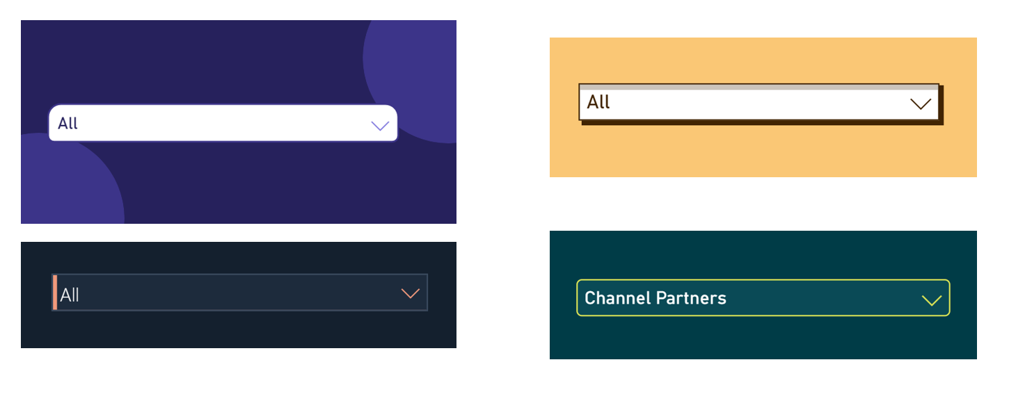
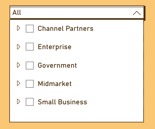
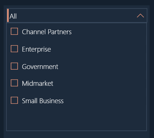
Settings lists undersell things, so I rebuilt four slicer designs using nothing beyond these options, the June selection icon colour and a page background. No custom visuals anywhere. Each of these took under ten minutes, and every colour sits in the format pane, so any of them can live in a report theme rather than being hand-set per slicer.

Three things to know before you roll it out
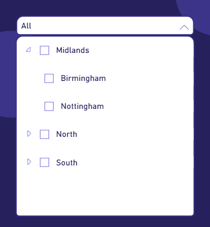
The settings are shared between the closed and open states: The corner radius you set applies to both the closed box and the open panel, and the panel sits flush against the box with no spacing control, so larger radii can look busy at the seam. Test your radius with the dropdown open before signing it off.
Composition tricks only style the closed box: Anything you place behind the slicer, like the shadow rectangle in the amber example, gets drawn over when the panel opens. Only the settings travel between states, so judge every design in its open state on the settings alone.
Go carefully with the conditional formatting: A slicer is a control, and the moment it starts signalling performance it has two jobs and users have to guess which one it is doing. The sensible use is signalling the slicer's own state, a border that changes colour when a selection is active, for instance. If you are building a traffic light into a filter, that probably belongs on a card.
If you are still weighing slicers against filters
If you are a step earlier and still working out when a slicer is even the right tool over the Filters pane, I have covered that properly in Power BI Slicer vs Filter: What's the Difference and When to Use Each.
The full settings reference for everything above is in the Slicer visual in Power BI documentation on Microsoft Learn.
Where we help
Formatting is the visible layer, and it pays off when the layer underneath is sound. At Metis BI we build and rebuild Power BI reports that people actually use, consistent, legible and designed around decisions. If your report estate has grown without a plan, our Power BI report development services are built for exactly that, and if you would rather your own team built this way, there is our Power BI training.
Summary
August 2026 gave the slicer visual its missing formatting controls, dropdown border, corners, open icon, accent bar, and hierarchy icon colours, all generally available and all supporting conditional formatting. Ten minutes of settings now does what used to take background shapes and resignation. Recolour your dark-theme slicers first, keep one style per report, and open the dropdown before you call any design done.


.png)
.avif)