





Hover over a data point in Power BI and you get the same thing you have always got, a little list of field names and values. Region, London. Sales, £17,162. Accurate, and completely silent on what any of it means. The tooltip states the data, it does not explain it.
There is now a middle option that changes that. Tooltip sentence format lets you write a plain sentence, with field references dropped in, and the tooltip fills in the values for whichever data point the user is hovering. No DAX measure, no separate tooltip page (which I still love btw). I have been testing it and it is a genuinely welcome addition, with one gotcha you need to understand before it will behave.
Definition: Sentence format is a tooltip option in the Power BI format pane (General, Tooltips, Options) that displays a written sentence about the hovered data point. You type a template mixing plain text with field references in curly braces, such as {Sales}, and Power BI substitutes each reference with the value for that data point.
Key takeaways:
- You write the sentence once as a template and it resolves per data point on hover.
- Field references only resolve if the hovered data point carries that field, the Tooltips well in the Build pane is how you guarantee it.
- Adding fields to the Tooltips can make the field list messy, and 3 toggles let you control exactly what shows.
- The template is static text, so any logic (up versus down, good versus bad) still needs a DAX measure referenced inside it.
- This sits between the standard tooltip and a report page tooltip, and each of the 3 levels has its place - we also have help tooltips but keeping them seperate.
The 3 levels of tooltip
Power BI tooltips have quietly become a 3 tier system.
The standard tooltip has been there from the start. It lists the fields behind the hovered data point, and you could always enrich it by dragging extra fields into the Tooltips section. Useful, but it is a list, and lists make the reader do the interpreting.
Then came report page tooltips, a full report page that appears on hover. I will say it plainly, we love these at Metis BI. Used properly they are one of the most insightful interactions in the product, a mini analysis appearing exactly where the question forms, not a gimmick. But they are a build. A dedicated page, sized, designed, filtered, maintained.
Sentence format is the missing middle. More meaning than a field list, a fraction of the effort of a tooltip page. That is a gap worth filling, and I am pleased with how they filled it.
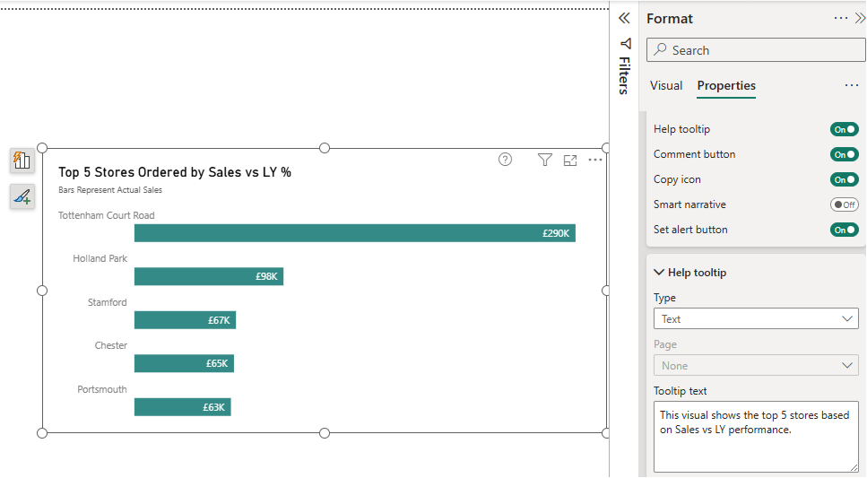
One more worth knowing, though it sits on a different axis to the rest. Help tooltips, the small question mark you switch on under Header icons, explain the visual itself rather than any data point behind it, and they are clicked rather than hovered. Below is a screenshot of this:
How it works, with a real example
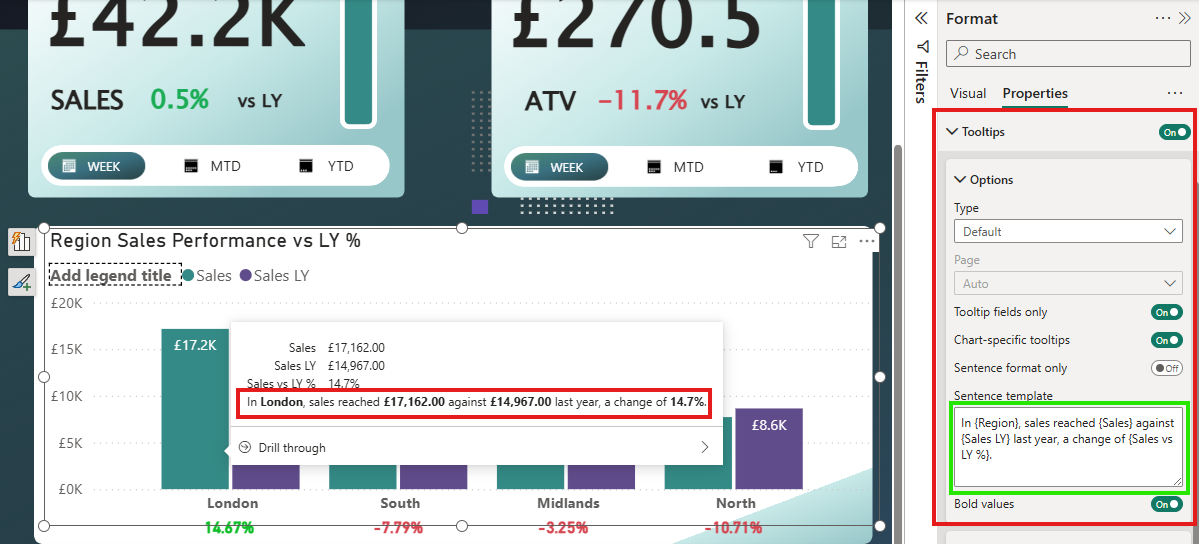
I tested this on a region sales chart with 3 measures, Sales, Sales LY and Sales vs LY %. In the format pane, under Properties, Tooltips, Options, there is a Sentence template box. I typed:
In {Region}, sales reached {Sales} against {Sales LY} last year, a change of {Sales vs LY %}.
Hover London and the tooltip reads "In London, sales reached £17,162.00 against £14,967.00 last year, a change of 14.7%", with the substituted values in bold thanks to the Bold values toggle. The braces must match the field names exactly as they appear in the visual.
That sentence used to require a DAX measure, FORMAT functions, ampersands, the lot. Now it is a text box.
The gotcha... field references need the data context
Here is where my first attempt did not behave, and it is worth understanding because it will catch almost everyone with a multi-measure visual.
When you hover a column, the tooltip picks up the values in that data point's context. Hover a Sales column and the tooltip carries Region and Sales, nothing else. So my {Sales LY} reference had no value to swap in... and the tooltip printed the raw placeholder, "{Sales LY}", right there in the sentence. Hover a Sales LY column and the opposite happened, {Sales} sat unresolved instead.
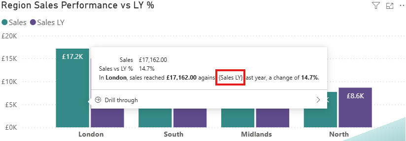
The fix is the Tooltips section in the Build pane. Dragging Sales LY into it made the field available on every data point, and the reference resolved. To make the sentence work when hovering either series, I added Sales as well, and Sales vs LY % so the change figure resolves on both columns too.
So the rule is simple. A reference only resolves if the hovered data point carries that field, and the Tooltips well is how you guarantee it does.
The mess, and the 3 toggles that fix it
There is a side effect. Once I had added those measures to the Tooltips well, the field list above my sentence got messy, Sales appearing twice, every measure listed, then the sentence repeating the same values underneath. Accurate, but cluttered.
Microsoft clearly saw this coming, because the same Options section carries 3 toggles, and I quite like having all 3:
- Tooltip fields only shows just the fields you explicitly added to the Tooltips well, hiding the visual's own fields. Full control of the list at last.
- Chart-specific tooltips switches on the chart-style tooltip presentation for the visual.
- Sentence format only drops the field list entirely and shows just your sentence.
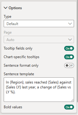
For this chart, Sentence format only was the winner. One clean line of English per data point.
One caution worth passing on. The template is static text. Write "a change of" and it says "a change of" everywhere, it cannot say "up" for London and "down" for Midlands. If you want that intelligence, build it in a small DAX text measure and reference the measure in the template, a smart sentence through a simple template. Also, there is a community-reported issue where Sentence format only interferes with the help tooltip icon in the visual header, showing the raw template instead of the help text, so test that combination if you use both.
For the full option list, the canonical reference is the Microsoft Learn page on visual tooltips.
Which level should you use?
A quick decision guide from how we approach it, because all 3 levels have a job.
The standard tooltip is right when the values speak for themselves and the visual is self-explanatory. Sentence format earns its place when a data point needs a line of interpretation, comparisons, context, a change figure explained in words. And a report page tooltip is for when the hover should answer the next question entirely, a breakdown, a trend, a mini analysis. Do not build a tooltip page where a sentence would do, and do not force a sentence where the reader really needs a chart.
That last judgement, deciding what the reader needs at the moment of hover, is report design work. It is the thinking behind everything we cover in what makes Power BI reports genuinely useful, and it is central to our Power BI report development service, where interactions like tooltips are designed around the decisions the report supports, not bolted on afterwards. A good fit for teams whose reports show the data but leave the reader to work out the story.
Summary
Sentence format tooltips let you replace or accompany the field list with a written sentence that resolves per data point, configured straight from the format pane with no DAX. Remember the one rule that makes it behave, a field reference only resolves if the hovered data point carries the field, and the Tooltips well in the Build pane is how you make sure it does. Then use the 3 toggles to keep the result clean.
Standard tooltips state the data. Report page tooltips analyse it. This one explains it, and a tooltip that explains is a small but real step towards reports that tell the reader what the numbers mean, not just what they are.


.png)