


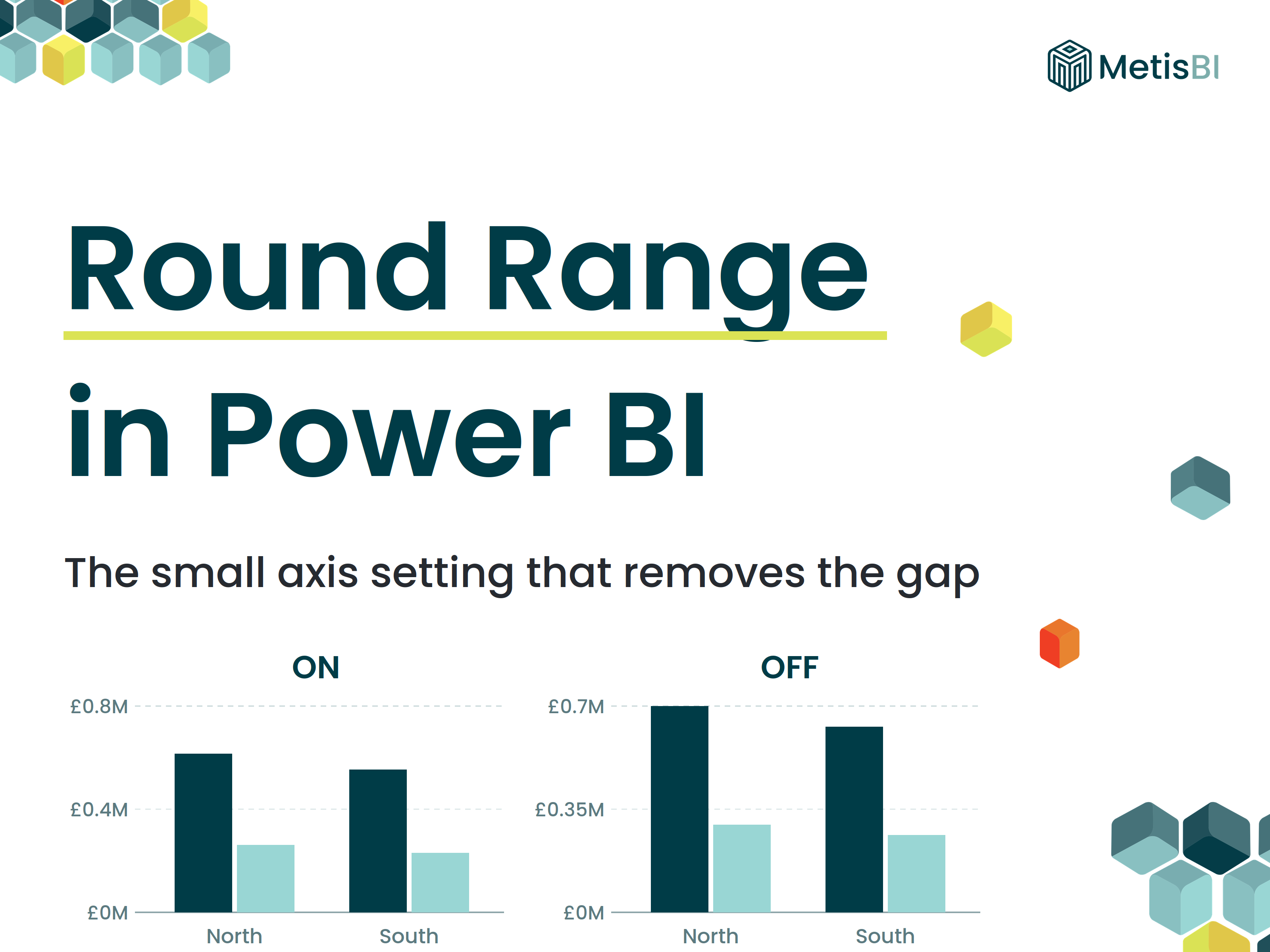


Ever noticed that empty space above the tallest bar in a Power BI chart? That gap exists because Power BI rounds the value axis up to a clean number by default, and until now the only way around it was setting the axis maximum yourself.
The June 2026 Power BI update changed that. Bar and column charts now have a Rounded range toggle, and turning it off makes the axis stop at your actual data. It is a small feature, but a welcome bit of control.
Definition: Round range is a formatting option on the value axis of Power BI bar and column charts. When on (the default), Power BI rounds the axis maximum up to a clean interval, leaving padding above the tallest bar. When off, the axis maximum matches your data maximum, so the tallest bar sits flush with the top of the plot area.
Key takeaways:
- Rounded range is on by default, which is the behaviour Power BI has always had
- Turning it off removes the padding, so the axis ends at your actual data maximum
- It is generally available in the June 2026 update, no preview flag needed
- The same update also stops data labels from shifting the axis range
- It removes a common reason for hardcoding axis maximums, which could clip bars once data grew past them
Why Power BI adds space above the tallest bar
Take an example from my own test which you can see below. My top value was £0.71M, but Power BI drew the axis up to £0.8M, a rounder number that gives tidy tick labels. The result, a chunk of empty space between the tallest bar and the top of the visual.
Most of the time nobody minds. But on dense report pages and tight dashboard layouts, that dead space adds up. And the old workarounds were all a bit rubbish. You could hardcode the axis maximum, which worked until the data grew past it and your bars got clipped, or drive the range with a DAX measure, which is a lot of machinery for what should be a formatting toggle.
What the Rounded range toggle actually does
It sits in the format pane on the value axis for bar and column charts. Two states:
Rounded range ON (the default): This is classic Power BI behaviour. In my test, data max of £0.71M, axis drawn to £0.8M, gap above the tallest bar. Nothing has changed here, your existing reports look exactly as they did.
Rounded range OFF (the new part): The axis maximum snaps to your data maximum. The tallest bar sits flush with the top of the plot area. No padding, no wasted space.
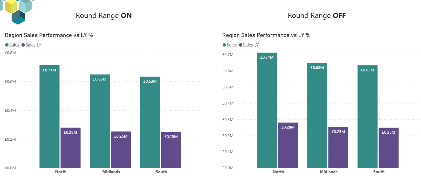
One naming note, because it caught me out. The toggle is named for the rounding, not the padding. So ON means "round my axis" (gap) and OFF means "do not round" (flush). Read it quickly and you can easily assume it works the other way. I did, briefly!
Data labels no longer shift the axis
There is a second improvement bundled in here. Adding data labels to a bar or column chart no longer shifts the axis range. Previously, switching labels on could inflate the axis to make room above the tallest bar, so the same chart had a different scale depending on whether labels were showing. If you have ever placed 2 charts side by side and wondered why the scales did not quite line up... this was sometimes why. Now the axis stays put either way.
Should you turn Rounded range off?
Not everywhere, no. The rounded axis exists for a reason. Clean tick labels are easier to read, and a bit of headroom stops a chart feeling cramped. For a standard standalone chart, I would leave the default alone most times.
Where turning it off earns its place:
- Tight dashboard layouts where every pixel of canvas is doing work.
- Minimal or sparkline-style bars where the axis is hidden anyway and the padding just shrinks your bars for no benefit.
- Any visual where a stakeholder has specifically asked why the bars do not reach the top.
A word of caution from experience, be consistent. A page where some charts are flush and some are padded looks like an accident, not a design choice. Pick a rule for the report and apply it across the page.
Small formatting decisions like this are part of what separates a report people trust from one they squint at. If your estate is full of reports that were built fast and never refined, our Power BI report development service covers exactly this, from layout and axis discipline through to the data model underneath. And before any report of ours goes out the door, it runs through the same pre-launch checks we share in our Power BI checklist.
For the full mechanics of axis ranges, see the Microsoft reference here: Microsoft Learn page on customising axis properties.
Summary
Rounded range is a small toggle with a simple job. On, and Power BI rounds your value axis up to a clean number, gap and all, the default behaviour it has had all along. Off, and the axis ends at your data, tallest bar flush with the top. It is generally available in the June 2026 update for bar and column charts, and the same release stops data labels from nudging the axis around.
It will not transform any report on its own. But it hands developers one more piece of deliberate control over how a chart reads. That is what good report design is in practice, a stack of small decisions made on purpose.


.png)
.png)